6 N-Integration
N-Integration is the framework of having multiple datasets which measure different aspects of the same samples. For example, you may have transcriptomic, genetic and proteomic data for the same set of cells. N-integrative methods are built to use the information in all three of these dataframes simultaenously.
DIABLO is a novel mixOmics framework for the integration of multiple data sets while explaining their relationship with a categorical outcome variable. DIABLO stands for Data Integration Analysis for Biomarker discovery using Latent variable approaches for Omics studies. It can also be referred to as Multiblock (s)PLS-DA.
6.1 Block sPLS-DA on the TCGA case study
Human breast cancer is a heterogeneous disease in terms of molecular alterations, cellular composition, and clinical outcome. Breast tumours can be classified into several subtypes, according to their levels of mRNA expression (Sørlie et al. 2001). Here we consider a subset of data generated by The Cancer Genome Atlas Network (Cancer Genome Atlas Network et al. 2012). For the package, data were normalised, and then drastically prefiltered for illustrative purposes.
The data were divided into a training set with a subset of 150 samples from the mRNA, miRNA and proteomics data, and a test set including 70 samples, but only with mRNA and miRNA data (the proteomics data are missing). The aim of this integrative analysis is to identify a highly correlated multi-omics signature discriminating the breast cancer subtypes Basal, Her2 and LumA.
The breast.TCGA (more details can be found in ?breast.TCGA) is a list containing training and test sets of omics data data.train and data.test which include:
$miRNA: A data frame with 150 (70) rows and 184 columns in the training (test) data set for the miRNA expression levels,$mRNA: A data frame with 150 (70) rows and 520 columns in the training (test) data set for the mRNA expression levels,$protein: A data frame with 150 rows and 142 columns in the training data set for the protein abundance (there are no proteomics in the test set),$subtype: A factor indicating the breast cancer subtypes in the training (for 150 samples) and test sets (for 70 samples).
This case study covers an interesting scenario where one omic data set is missing in the test set, but because the method generates a set of components per training data set, we can still assess the prediction or performance evaluation using majority or weighted prediction vote.
6.2 Load the data
To illustrate the multiblock sPLS-DA approach, we will integrate the expression levels of miRNA, mRNA and the abundance of proteins while discriminating the subtypes of breast cancer, then predict the subtypes of the samples in the test set.
The input data is first set up as a list of \(Q\) matrices \(\boldsymbol X_1, \dots, \boldsymbol X_Q\) and a factor indicating the class membership of each sample \(\boldsymbol Y\). Each data frame in \(\boldsymbol X\) should be named as we will match these names with the keepX parameter for the sparse method.
library(mixOmics)
data(breast.TCGA)

# Extract training data and name each data frame
# Store as list
X <- list(mRNA = breast.TCGA$data.train$mrna,
          miRNA = breast.TCGA$data.train$mirna,
          protein = breast.TCGA$data.train$protein)

# Outcome
Y <- breast.TCGA$data.train$subtype
summary(Y)
## Basal Her2 LumA
## 45 30 756.3 Parameter choice
6.3.1 Design matrix
The choice of the design can be motivated by different aspects, including:
Biological apriori knowledge: Should we expect
mRNAandmiRNAto be highly correlated?Analytical aims: As further developed in Singh et al. (2019), a compromise needs to be achieved between a classification and prediction task, and extracting the correlation structure of the data sets. A full design with weights = 1 will favour the latter, but at the expense of classification accuracy, whereas a design with small weights will lead to a highly predictive signature. This pertains to the complexity of the analytical task involved as several constraints are included in the optimisation procedure. For example, here we choose a 0.1 weighted model as we are interested in predicting test samples later in this case study.
design <- matrix(0.1, ncol = length(X), nrow = length(X),
                dimnames = list(names(X), names(X)))
diag(design) <- 0
design
## mRNA miRNA protein
## mRNA 0.0 0.1 0.1
## miRNA 0.1 0.0 0.1
## protein 0.1 0.1 0.0Note however that even with this design, we will still unravel a correlated signature as we require all data sets to explain the same outcome \(\boldsymbol y\), as well as maximising pairs of covariances between data sets.
- Data-driven option: we could perform regression analyses with PLS to further understand the correlation between data sets. Here for example, we run PLS with one component and calculate the cross-correlations between components associated to each data set:
res1.pls.tcga <- pls(X$mRNA, X$protein, ncomp = 1)
cor(res1.pls.tcga$variates$X, res1.pls.tcga$variates$Y)

res2.pls.tcga <- pls(X$mRNA, X$miRNA, ncomp = 1)
cor(res2.pls.tcga$variates$X, res2.pls.tcga$variates$Y)

res3.pls.tcga <- pls(X$protein, X$miRNA, ncomp = 1)
cor(res3.pls.tcga$variates$X, res3.pls.tcga$variates$Y)
## comp1
## comp1 0.9031761
## comp1
## comp1 0.8456299
## comp1
## comp1 0.7982008The data sets taken in a pairwise manner are highly correlated, indicating that a design with weights \(\sim 0.8 - 0.9\) could be chosen.
6.3.2 Number of components
As in the PLS-DA framework presented in Module 3, we first fit a block.plsda model without variable selection to assess the global performance of the model and choose the number of components. We run perf() with 10-fold cross validation repeated 10 times for up to 5 components and with our specified design matrix. Similar to PLS-DA, we obtain the performance of the model with respect to the different prediction distances (Figure 6.1):
diablo.tcga <- block.plsda(X, Y, ncomp = 5, design = design)

set.seed(123) # For reproducibility, remove for your analyses
perf.diablo.tcga = perf(diablo.tcga, validation = 'Mfold', folds = 10, nrepeat = 10)

#perf.diablo.tcga$error.rate  # Lists the different types of error rates

# Plot of the error rates based on weighted vote
plot(perf.diablo.tcga)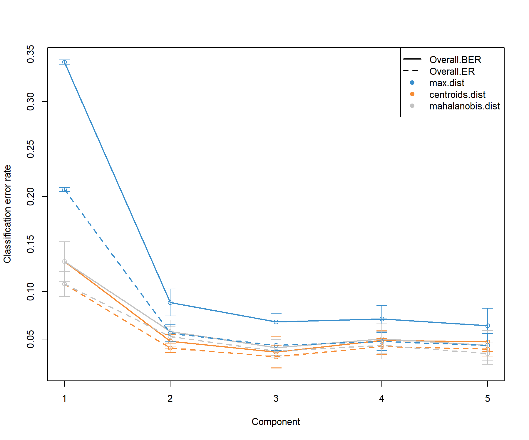
Figure 6.1: Choosing the number of components in block.plsda using perf() with 10 x 10-fold CV function in the breast.TCGA study. Classification error rates (overall and balanced, see Module 2) are represented on the y-axis with respect to the number of components on the x-axis for each prediction distance presented in PLS-DA in Seciton 3.4 and detailed in Extra reading material 3 from Module 3. Bars show the standard deviation across the 10 repeated folds. The plot shows that the error rate reaches a minimum from 2 to 3 dimensions.
The performance plot indicates that two components should be sufficient in the final model, and that the centroids distance might lead to better prediction. A balanced error rate (BER) should be considered for further analysis.
The following outputs the optimal number of components according to the prediction distance and type of error rate (overall or balanced), as well as a prediction weighting scheme illustrated further below.
##             max.dist centroids.dist mahalanobis.dist
## Overall.ER         3              3                3
## Overall.BER        3              3                3
Thus, here we choose our final ncomp value:
6.3.3 Number of variables to select
We then choose the optimal number of variables to select in each data set using the tune.block.splsda function. The function tune() is run with 10-fold cross validation, but repeated only once (nrepeat = 1) for illustrative and computational reasons here. For a thorough tuning process, we advise increasing the nrepeat argument to 10-50, or more.
We choose a keepX grid that is relatively fine at the start, then coarse. If the data sets are easy to classify, the tuning step may indicate the smallest number of variables to separate the sample groups. Hence, we start our grid at the value 5 to avoid a too small signature that may preclude biological interpretation.
# chunk takes about 2 min to run
set.seed(123) # for reproducibility
test.keepX <- list(mRNA = c(5:9, seq(10, 25, 5)),
                   miRNA = c(5:9, seq(10, 20, 2)),
                   proteomics = c(seq(5, 25, 5)))

tune.diablo.tcga <- tune.block.splsda(X, Y, ncomp = 2,
                              test.keepX = test.keepX, design = design,
                              validation = 'Mfold', folds = 10, nrepeat = 1,
                              BPPARAM = BiocParallel::SnowParam(workers = 2),
                              dist = "centroids.dist")

list.keepX <- tune.diablo.tcga$choice.keepX
Note:
- For fast computation, we can use parallel computing here - this option is also enabled on a laptop or workstation, see
?tune.block.splsda.
The number of features to select on each component is returned and stored for the final model:
## $mRNA
## [1]  8 25
##
## $miRNA
## [1] 14  5
##
## $protein
## [1] 10  5
Note:
- You can skip any of the tuning steps above, and hard code your chosen
ncompandkeepXparameters (as a list for the latter, as shown below).
6.4 Final model
The final multiblock sPLS-DA model includes the tuned parameters and is run as:
## Design matrix has changed to include Y; each block will be
## linked to Y.A warning message informs us that the outcome \(\boldsymbol Y\) has been included automatically in the design, so that the covariance between each block’s component and the outcome is maximised, as shown in the final design output:
##         mRNA miRNA protein Y
## mRNA     0.0   0.1     0.1 1
## miRNA    0.1   0.0     0.1 1
## protein  0.1   0.1     0.0 1
## Y        1.0   1.0     1.0 0
The selected variables can be extracted with the function selectVar(), for example in the mRNA block, along with their loading weights (not output here):
Note:
- The stability of the selected variables can be extracted from the
perf()function, similar to the example given in the PLS-DA analysis (Module 3).
6.5 Sample plots
6.5.1 plotDiablo
plotDiablo() is a diagnostic plot to check whether the correlations between components from each data set were maximised as specified in the design matrix. We specify the dimension to be assessed with the ncomp argument (Figure 6.2).
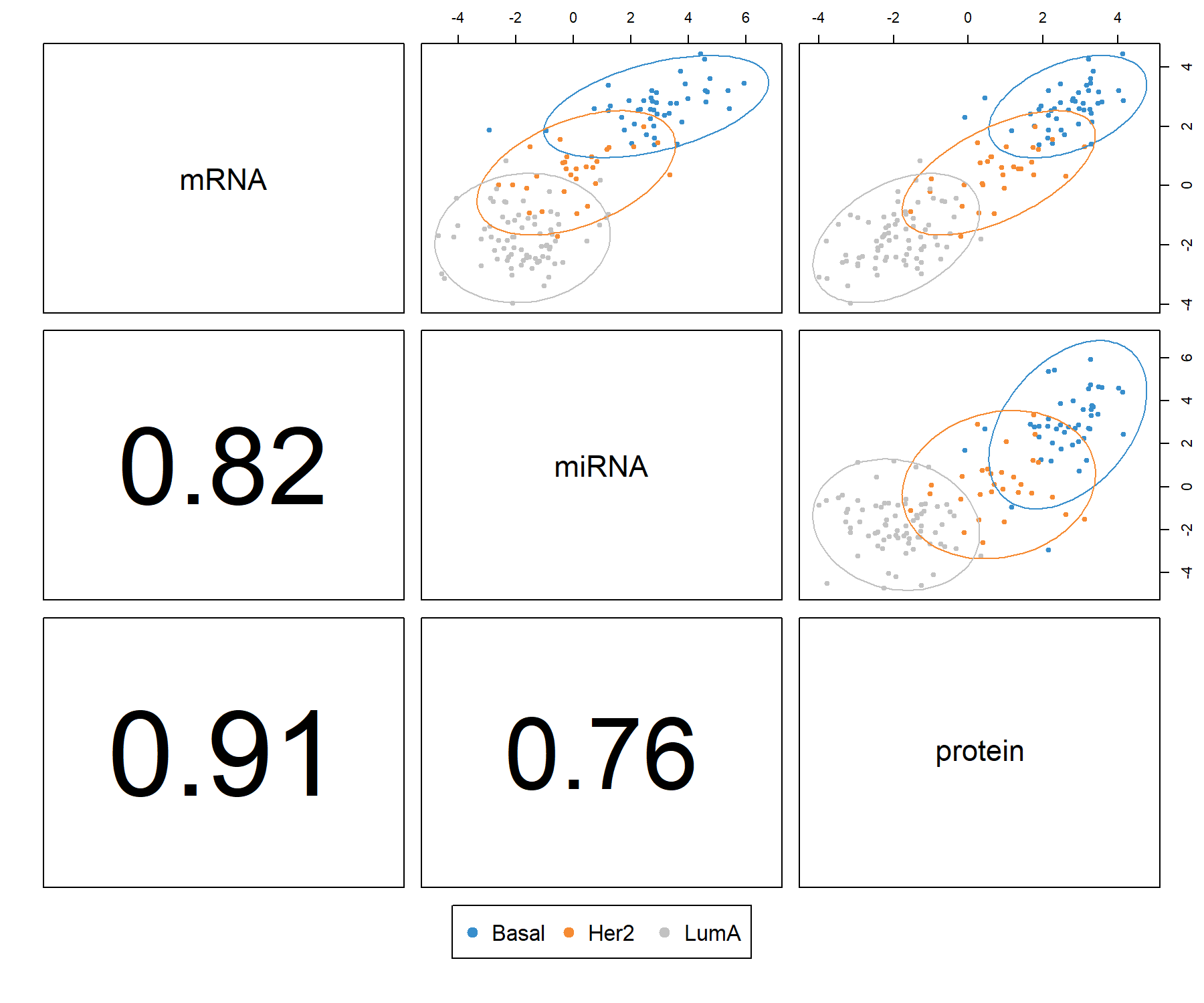
Figure 6.2: Diagnostic plot from multiblock sPLS-DA applied on the breast.TCGA study. Samples are represented based on the specified component (here ncomp = 1) for each data set (mRNA, miRNA and protein). Samples are coloured by breast cancer subtype (Basal, Her2 and LumA) and 95% confidence ellipse plots are represented. The bottom left numbers indicate the correlation coefficients between the first components from each data set. In this example, mRNA expression and protein concentration are highly correlated on the first dimension.
The plot indicates that the first components from all data sets are highly correlated. The colours and ellipses represent the sample subtypes and indicate the discriminative power of each component to separate the different tumour subtypes. Thus, multiblock sPLS-DA is able to extract a strong correlation structure between data sets, as well as discriminate the breast cancer subtypes on the first component.
6.5.2 plotIndiv
The sample plot with the plotIndiv() function projects each sample into the space spanned by the components from each block, resulting in a series of graphs corresponding to each data set (Figure 6.3). The optional argument blocks can output a specific data set. Ellipse plots are also available (argument ellipse = TRUE).
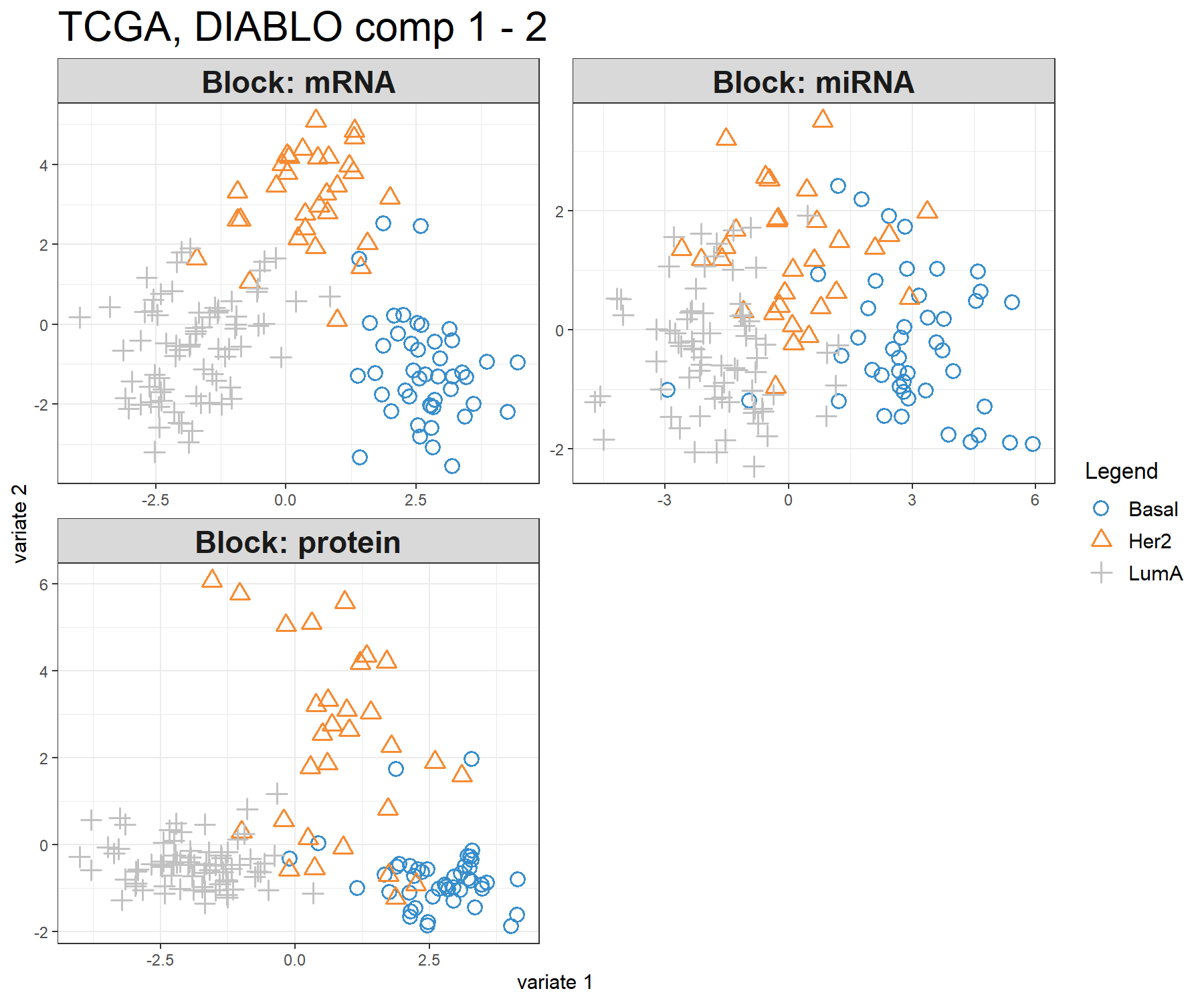
Figure 6.3: Sample plot from multiblock sPLS-DA performed on the breast.TCGA study. The samples are plotted according to their scores on the first 2 components for each data set. Samples are coloured by cancer subtype and are classified into three classes: Basal, Her2 and LumA. The plot shows the degree of agreement between the different data sets and the discriminative ability of each data set.
This type of graphic allows us to better understand the information extracted from each data set and its discriminative ability. Here we can see that the LumA group can be difficult to classify in the miRNA data.
Note:
- Additional variants include the argument
block = 'average'that averages the components from all blocks to produce a single plot. The argumentblock='weighted.average'is a weighted average of the components according to their correlation with the components associated with the outcome.
6.5.3 plotArrow
In the arrow plot in Figure 6.4, the start of the arrow indicates the centroid between all data sets for a given sample and the tip of the arrow the location of that same sample but in each block. Such graphics highlight the agreement between all data sets at the sample level when modelled with multiblock sPLS-DA.
Figure 6.4: Arrow plot from multiblock sPLS-DA performed on the breast.TCGA study. The samples are projected into the space spanned by the first two components for each data set then overlaid across data sets. The start of the arrow indicates the centroid between all data sets for a given sample and the tip of the arrow the location of the same sample in each block. Arrows further from their centroid indicate some disagreement between the data sets. Samples are coloured by cancer subtype (Basal, Her2 and LumA).
This plot shows that globally, the discrimination of all breast cancer subtypes can be extracted from all data sets, however, there are some dissimilarities at the samples level across data sets (the common information cannot be extracted in the same way across data sets).
6.6 Variable plots
The visualisation of the selected variables is crucial to mine their associations in multiblock sPLS-DA. Here we revisit existing outputs presented in Module 2 with further developments for multiple data set integration. All the plots presented provide complementary information for interpreting the results.
6.6.1 plotVar
The correlation circle plot highlights the contribution of each selected variable to each component. Important variables should be close to the large circle (see Module 2). Here, only the variables selected on components 1 and 2 are depicted (across all blocks), see Figure 6.5. Clusters of points indicate a strong correlation between variables. For better visibility we chose to hide the variable names.
plotVar(diablo.tcga, var.names = FALSE, style = 'graphics', legend = TRUE,
        pch = c(16, 17, 15), cex = c(2,2,2),
        col = c('darkorchid', 'brown1', 'lightgreen'),
        title = 'TCGA, DIABLO comp 1 - 2')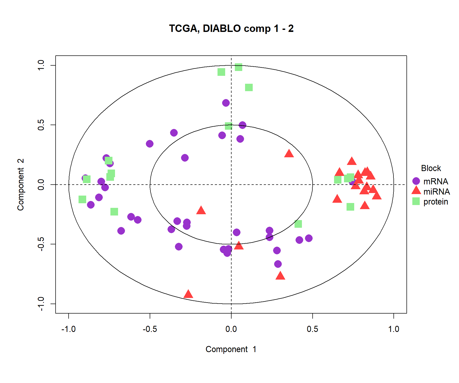
Figure 6.5: Correlation circle plot from multiblock sPLS-DA performed on the breast.TCGA study. The variable coordinates are defined according to their correlation with the first and second components for each data set. Variable types are indicated with different symbols and colours, and are overlaid on the same plot. The plot highlights the potential associations within and between different variable types when they are important in defining their own component.
The correlation circle plot shows some positive correlations (between selected miRNA and proteins, between selected proteins and mRNA) and negative correlations between mRNAand miRNA on component 1. The correlation structure is less obvious on component 2, but we observe some key selected features (proteins and miRNA) that seem to highly contribute to component 2.
Note:
These results can be further investigated by showing the variable names on this plot (or extracting their coordinates available from the plot saved into an object, see
?plotVar), and looking at various outputs fromselectVar()andplotLoadings().You can choose to only show specific variable type names, e.g.
var.names = c(FALSE, FALSE, TRUE)(where each argument is assigned to a data set in \(\boldsymbol X\)). Here for example, the protein names only would be output.
6.6.2 circosPlot
The circos plot represents the correlations between variables of different types, represented on the side quadrants. Several display options are possible, to show within and between connections between blocks, and expression levels of each variable according to each class (argument line = TRUE). The circos plot is built based on a similarity matrix, which was extended to the case of multiple data sets from González et al. (2012) (see also Module 2 and Extra Reading material from that module). A cutoff argument can be further included to visualise correlation coefficients above this threshold in the multi-omics signature (Figure 6.6). The colours for the blocks and correlation lines can be chosen with color.blocks and color.cor respectively:
circosPlot(diablo.tcga, cutoff = 0.7, line = TRUE,
           color.blocks = c('darkorchid', 'brown1', 'lightgreen'),
           color.cor = c("chocolate3","grey20"), size.labels = 1.5)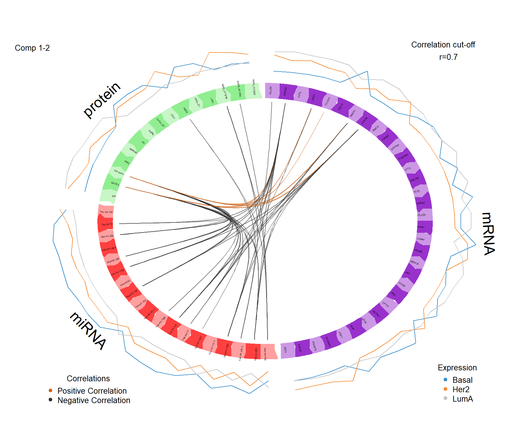
Figure 6.6: Circos plot from multiblock sPLS-DA performed on the breast.TCGA study. The plot represents the correlations greater than 0.7 between variables of different types, represented on the side quadrants. The internal connecting lines show the positive (negative) correlations. The outer lines show the expression levels of each variable in each sample group (Basal, Her2 and LumA).
The circos plot enables us to visualise cross-correlations between data types, and the nature of these correlations (positive or negative). Here we observe that correlations > 0.7 are between a few mRNAand some Proteins, whereas the majority of strong (negative) correlations are observed between miRNA and mRNAor Proteins. The lines indicating the average expression levels per breast cancer subtype indicate that the selected features are able to discriminate the sample groups.
6.6.3 network
Relevance networks, which are also built on the similarity matrix, can also visualise the correlations between the different types of variables. Each colour represents a type of variable. A threshold can also be set using the argument cutoff (Figure 6.7). By default the network includes only variables selected on component 1, unless specified in comp.
Note that sometimes the output may not show with Rstudio due to margin issues. We can either use X11() to open a new window, or save the plot as an image using the arguments save and name.save, as we show below. An interactive argument is also available for the cutoff argument, see details in ?network.
# X11()   # Opens a new window
network(diablo.tcga, blocks = c(1,2,3),
        cutoff = 0.4,
        color.node = c('darkorchid', 'brown1', 'lightgreen'),
        # To save the plot, uncomment below line
        #save = 'png', name.save = 'diablo-network'
        )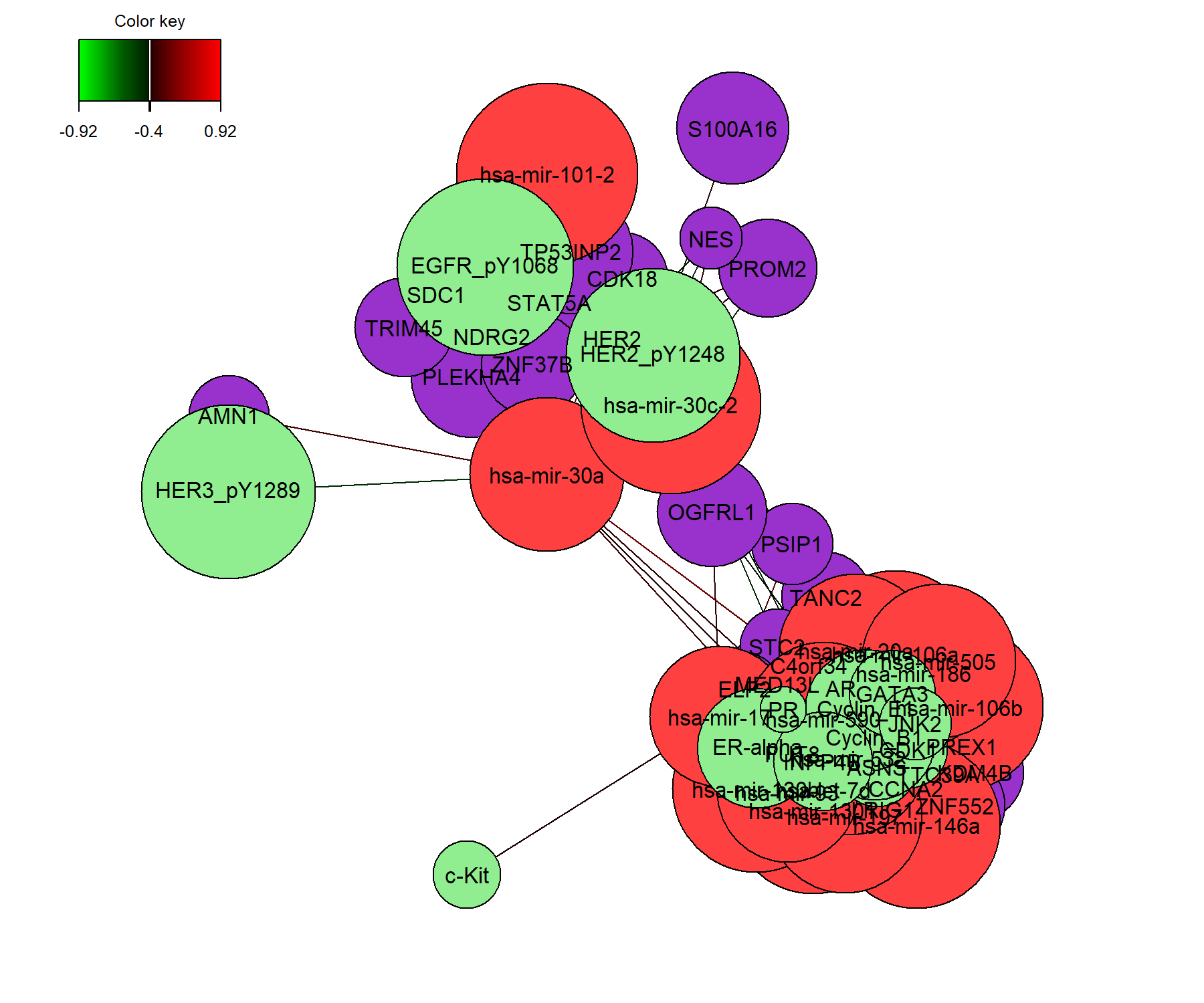
Figure 6.7: Relevance network for the variables selected by multiblock sPLS-DA performed on the breast.TCGA study on component 1. Each node represents a selected variable with colours indicating their type. The colour of the edges represent positive or negative correlations. Further tweaking of this plot can be obtained, see the help file ?network.
The relevance network in Figure 6.7 shows two groups of features of different types. Within each group we observe positive and negative correlations. The visualisation of this plot could be further improved by changing the names of the original features.
Note that the network can be saved in a .gml format to be input into the software Cytoscape, using the R package igraph (Csardi, Nepusz, et al. 2006):
6.6.4 plotLoadings
plotLoadings() visualises the loading weights of each selected variable on each component and each data set. The colour indicates the class in which the variable has the maximum level of expression (contrib = 'max') or minimum (contrib = 'min'), on average (method = 'mean') or using the median (method = 'median').
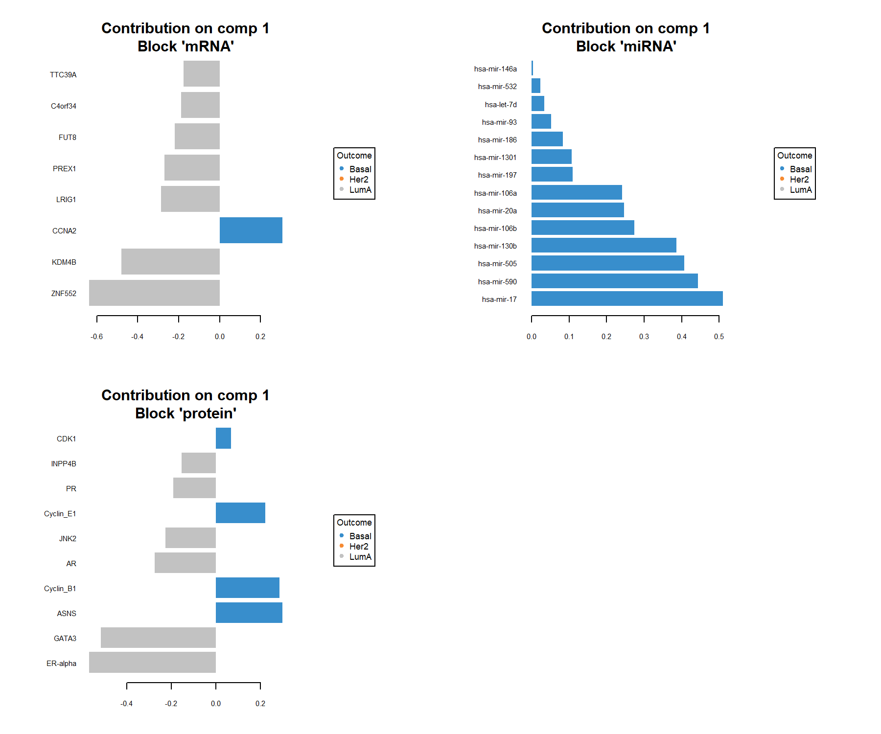
Figure 6.8: Loading plot for the variables selected by multiblock sPLS-DA performed on the breast.TCGA study on component 1. The most important variables (according to the absolute value of their coefficients) are ordered from bottom to top. As this is a supervised analysis, colours indicate the class for which the median expression value is the highest for each feature (variables selected characterise Basal and LumA).
The loading plot shows the multi-omics signature selected on component 1, where each panel represents one data type. The importance of each variable is visualised by the length of the bar (i.e. its loading coefficient value). The combination of the sign of the coefficient (positive / negative) and the colours indicate that component 1 discriminates primarily the Basal samples vs. the LumA samples (see the sample plots also). The features selected are highly expressed in one of these two subtypes. One could also plot the second component that discriminates the Her2 samples.
6.6.5 cimDiablo
The cimDiablo() function is a clustered image map specifically implemented to represent the multi-omics molecular signature expression for each sample. It is very similar to a classical hierarchical clustering (Figure 6.9).
cimDiablo(diablo.tcga, color.blocks = c('darkorchid', 'brown1', 'lightgreen'),
          comp = 1, margin=c(8,20), legend.position = "right")
##
## trimming values to [-3, 3] range for cim visualisation. See 'trim' arg in ?cimDiablo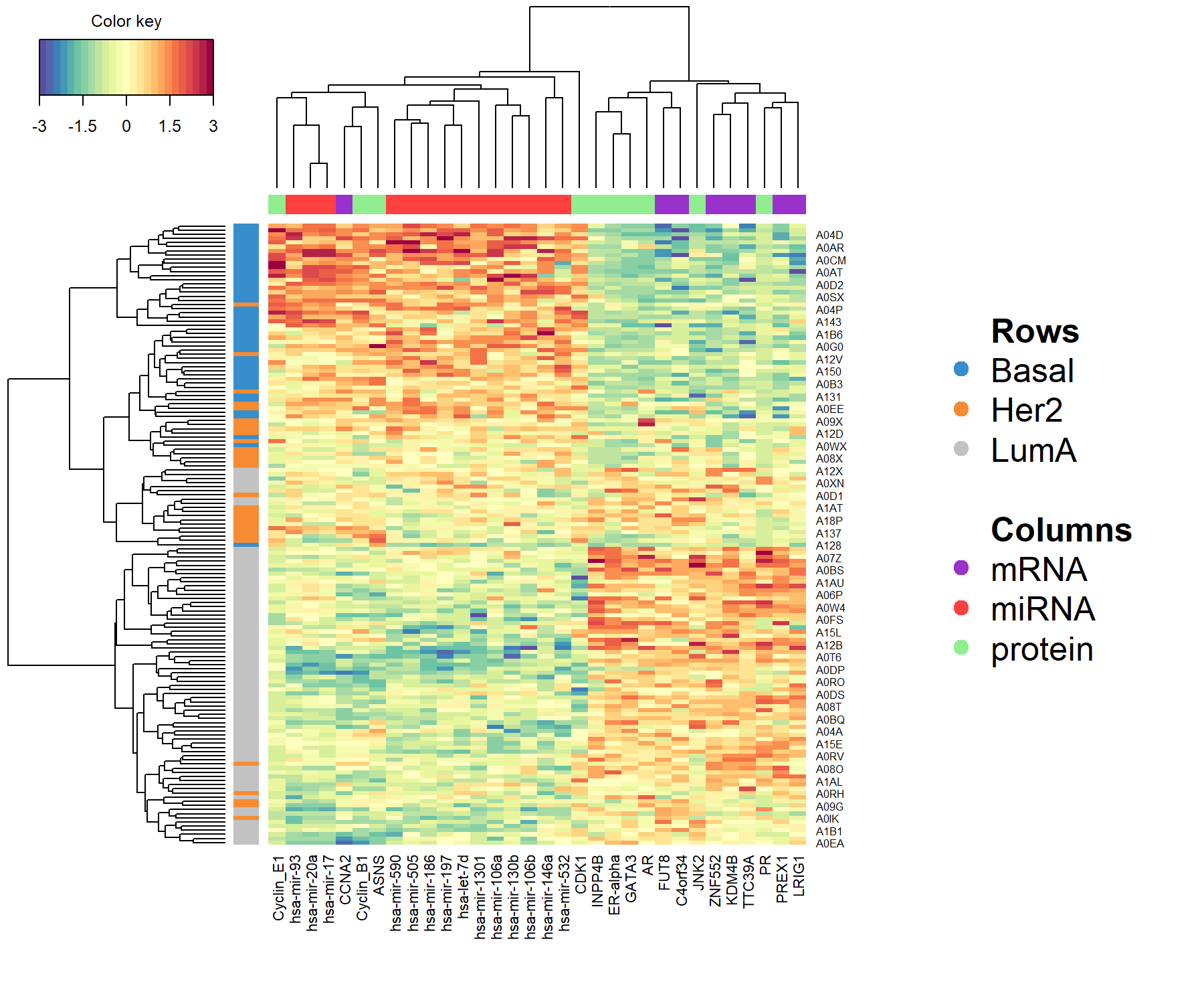
Figure 6.9: Clustered Image Map for the variables selected by multiblock sPLS-DA performed on the breast.TCGA study on component 1. By default, Euclidean distance and Complete linkage methods are used. The CIM represents samples in rows (indicated by their breast cancer subtype on the left hand side of the plot) and selected features in columns (indicated by their data type at the top of the plot).
According to the CIM, component 1 seems to primarily classify the Basal samples, with a group of overexpressed miRNA and underexpressed mRNAand proteins. A group of LumA samples can also be identified due to the overexpression of the same mRNAand proteins. Her2 samples remain quite mixed with the other LumA samples.
6.7 Model performance and prediction
We assess the performance of the model using 10-fold cross-validation repeated 10 times with the function perf(). The method runs a block.splsda() model on the pre-specified arguments input from our final object diablo.tcga but on cross-validated samples. We then assess the accuracy of the prediction on the left out samples. Since the tune() function was used with the centroid.dist argument, we examine the outputs of the perf() function for that same distance:
set.seed(123) # For reproducibility with this handbook, remove otherwise
perf.diablo.tcga <- perf(diablo.tcga,  validation = 'Mfold', folds = 10,
                         nrepeat = 10, dist = 'centroids.dist')

#perf.diablo.tcga  # Lists the different outputs
We can extract the (balanced) classification error rates globally or overall with
perf.diablo.tcga$error.rate.per.class, the predicted components associated to \(\boldsymbol Y\), or the stability of the selected features with perf.diablo.tcga$features.
Here we look at the different performance assessment schemes specific to multiple data set integration.
First, we output the performance with the majority vote, that is, since the prediction is based on the components associated to their own data set, we can then weight those predictions across data sets according to a majority vote scheme. Based on the predicted classes, we then extract the classification error rate per class and per component:
## $centroids.dist
##                  comp1      comp2      comp3
## Basal       0.02444444 0.04444444 0.07333333
## Her2        0.20666667 0.11666667 0.21000000
## LumA        0.04266667 0.01200000 0.06533333
## Overall.ER  0.07000000 0.04266667 0.09666667
## Overall.BER 0.09125926 0.05770370 0.11622222
The output shows that with the exception of the Basal samples, the classification improves with the addition of the second component.
Another prediction scheme is to weight the classification error rate from each data set according to the correlation between the predicted components and the \(\boldsymbol Y\) outcome.
## $centroids.dist
##                   comp1      comp2      comp3
## Basal       0.004444444 0.04444444 0.06222222
## Her2        0.140000000 0.10000000 0.16333333
## LumA        0.042666667 0.01200000 0.06533333
## Overall.ER  0.050666667 0.03933333 0.08400000
## Overall.BER 0.062370370 0.05214815 0.09696296
Compared to the previous majority vote output, we can see that the classification accuracy is slightly better on component 2 for the subtype Her2.
An AUC plot per block is plotted using the function auroc(). We have already mentioned in Module 3 for PLS-DA, the interpretation of this output may not be particularly insightful in relation to the performance evaluation of our methods, but can complement the statistical analysis. For example, here for the miRNA data set once we have reached component 2 (Figure 6.10):
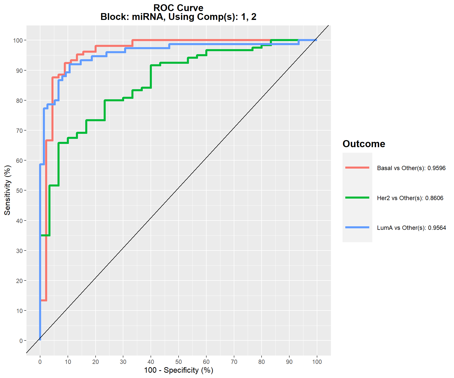
Figure 6.10: ROC and AUC based on multiblock sPLS-DA performed on the breast.TCGA study for the miRNA data set after 2 components. The function calculates the ROC curve and AUC for one class vs. the others. If we set print = TRUE, the Wilcoxon test p-value that assesses the differences between the predicted components from one class vs. the others is output.
Figure 6.10 shows that the Her2 subtype is the most difficult to classify with multiblock sPLS-DA compared to the other subtypes.
The predict() function associated with a block.splsda() object predicts the class of samples from an external test set. In our specific case, one data set is missing in the test set but the method can still be applied. We need to ensure the names of the blocks correspond exactly to those from the training set:
# Prepare test set data: here one block (proteins) is missing
data.test.tcga <- list(mRNA = breast.TCGA$data.test$mrna,
                      miRNA = breast.TCGA$data.test$mirna)

predict.diablo.tcga <- predict(diablo.tcga, newdata = data.test.tcga)
# The warning message will inform us that one block is missing

#predict.diablo # List the different outputs
The following output is a confusion matrix that compares the real subtypes with the predicted subtypes for a 2 component model, for the distance of interest centroids.dist and the prediction scheme WeightedVote:
confusion.mat.tcga <- get.confusion_matrix(truth = breast.TCGA$data.test$subtype,
                     predicted = predict.diablo.tcga$WeightedVote$centroids.dist[,2])
confusion.mat.tcga
## predicted.as.Basal predicted.as.Her2 predicted.as.LumA
## Basal 20 1 0
## Her2 0 13 1
## LumA 0 3 32From this table, we see that one Basal and one Her2 sample are wrongly predicted as Her2 and Lum A respectively, and 3 LumA samples are wrongly predicted as Her2. The balanced prediction error rate can be obtained as:
## [1] 0.06825397It would be worthwhile at this stage to revisit the chosen design of the multiblock sPLS-DA model to assess the influence of the design on the prediction performance on this test set - even though this back and forth analysis is a biased criterion to choose the design!