4 PLS on the liver toxicity study
The data come from a liver toxicity study in which 64 male rats were exposed to non-toxic (50 or 150 mg/kg), moderately toxic (1500 mg/kg) or severely toxic (2000 mg/kg) doses of acetaminophen (paracetamol) (Bushel, Wolfinger, and Gibson 2007). Necropsy was performed at 6, 18, 24 and 48 hours after exposure and the mRNA was extracted from the liver. Ten clinical measurements of markers for liver injury are available for each subject. The microarray data contain expression levels of 3,116 genes. The data were normalised and preprocessed by Bushel, Wolfinger, and Gibson (2007).
liver toxicity contains the following:
$gene: A data frame with 64 rows (rats) and 3116 columns (gene expression levels),$clinic: A data frame with 64 rows (same rats) and 10 columns (10 clinical variables),$treatment: A data frame with 64 rows and 4 columns, describe the different treatments, such as doses of acetaminophen and times of necropsy.
We can analyse these two data sets (genes and clinical measurements) using sPLS1, then sPLS2 with a regression mode to explain or predict the clinical variables with respect to the gene expression levels.
4.1 Load the data
## These packages have more recent versions available.
## It is recommended to update all of them.
## Which would you like to update?
##
##  1: All
##  2: CRAN packages only
##  3: None
##  4: xfun     (0.50   -> 0.51  ) [CRAN]
##  5: rlang    (1.1.4  -> 1.1.5 ) [CRAN]
##  6: R6       (2.5.1  -> 2.6.1 ) [CRAN]
##  7: cli      (3.6.3  -> 3.6.4 ) [CRAN]
##  8: mime     (0.12   -> 0.13  ) [CRAN]
##  9: tinytex  (0.54   -> 0.56  ) [CRAN]
## 10: bslib    (0.8.0  -> 0.9.0 ) [CRAN]
## 11: knitr    (1.49   -> 1.50  ) [CRAN]
## 12: jsonlite (1.8.9  -> 1.9.1 ) [CRAN]
## 13: cpp11    (0.5.1  -> 0.5.2 ) [CRAN]
## 14: purrr    (1.0.2  -> 1.0.4 ) [CRAN]
## 15: rgl      (1.3.16 -> 1.3.17) [CRAN]
## 16: igraph   (2.1.2  -> 2.1.4 ) [CRAN]
##
## ── R CMD build ────────────────────────────────────────────────────────────────────────────────────────────────────────────────────────────────
##      checking for file ‘/private/tmp/RtmpnHWlsz/remotes24854eb33203/mixOmicsTeam-mixOmics-40581c5/DESCRIPTION’ ...  ✔  checking for file ‘/private/tmp/RtmpnHWlsz/remotes24854eb33203/mixOmicsTeam-mixOmics-40581c5/DESCRIPTION’
##   ─  preparing ‘mixOmics’:
##        checking DESCRIPTION meta-information ...  ✔  checking DESCRIPTION meta-information
##   ─  checking for LF line-endings in source and make files and shell scripts
##   ─  checking for empty or unneeded directories
##   ─  looking to see if a ‘data/datalist’ file should be added
##   ─  building ‘mixOmics_6.31.4.tar.gz’
##
## As we have discussed previously for integrative analysis, we need to ensure that the samples in the two data sets are in the same order, or matching, as we are performing data integration:
##   rownames.X. rownames.Y.
## 1       ID202       ID202
## 2       ID203       ID203
## 3       ID204       ID204
## 4       ID206       ID206
## 5       ID208       ID208
## 6       ID209       ID209
4.2 Example: sPLS1 regression
We first start with a simple case scenario where we wish to explain one \(\boldsymbol Y\) variable with a combination of selected \(\boldsymbol X\) variables (transcripts). We choose the following clinical measurement which we denote as the \(\boldsymbol y\) single response variable:
4.2.1 Number of dimensions using the \(Q^2\) criterion
Defining the ‘best’ number of dimensions to explain the data requires we first launch a PLS1 model with a large number of components. Some of the outputs from the PLS1 object are then retrieved in the perf() function to calculate the \(Q^2\) criterion using repeated 10-fold cross-validation.
tune.pls1.liver <- pls(X = X, Y = y, ncomp = 4, mode = 'regression')
set.seed(33)  # For reproducibility with this handbook, remove otherwise
Q2.pls1.liver <- perf(tune.pls1.liver, validation = 'Mfold',
                      folds = 10, nrepeat = 5)
plot(Q2.pls1.liver, criterion = 'Q2')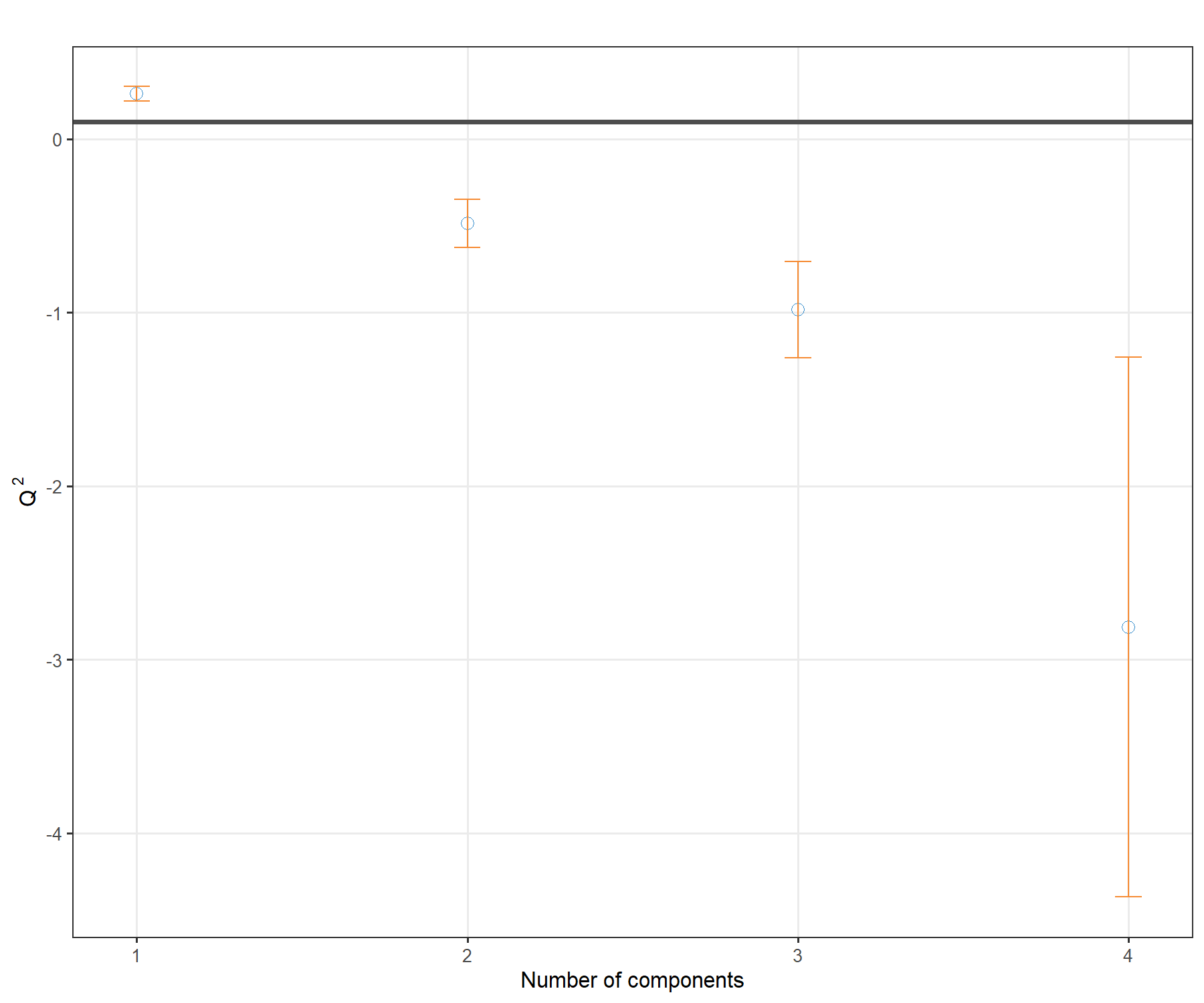
Figure 4.1: \(Q^2\) criterion to choose the number of components in PLS1. For each dimension added to the PLS model, the \(Q^2\) value is shown. The horizontal line of 0.0975 indicates the threshold below which adding a dimension may not be beneficial to improve accuracy in PLS.
The plot in Figure 4.1 shows that the \(Q^2\) value varies with the number of dimensions added to PLS1, with a decrease to negative values from 2 dimensions. Based on this plot we would choose only one dimension, but we will still add a second dimension for the graphical outputs.
Note:
- One dimension is not unusual given that we only include one \(\boldsymbol y\) variable in PLS1.
4.2.2 Number of variables to select in \(\boldsymbol X\)
We now set a grid of values - thin at the start, but also restricted to a small number of genes for a parsimonious model, which we will test for each of the two components in the tune.spls() function, using the MAE criterion.
# Set up a grid of values:
list.keepX <- c(5:10, seq(15, 50, 5))

# list.keepX  # Inspect the keepX grid
set.seed(33)  # For reproducibility with this handbook, remove otherwise
tune.spls1.MAE <- tune.spls(X, y, ncomp= 2,
                            test.keepX = list.keepX,
                            validation = 'Mfold',
                            folds = 10,
                            nrepeat = 5,
                            progressBar = FALSE,
                            measure = 'MAE')
plot(tune.spls1.MAE)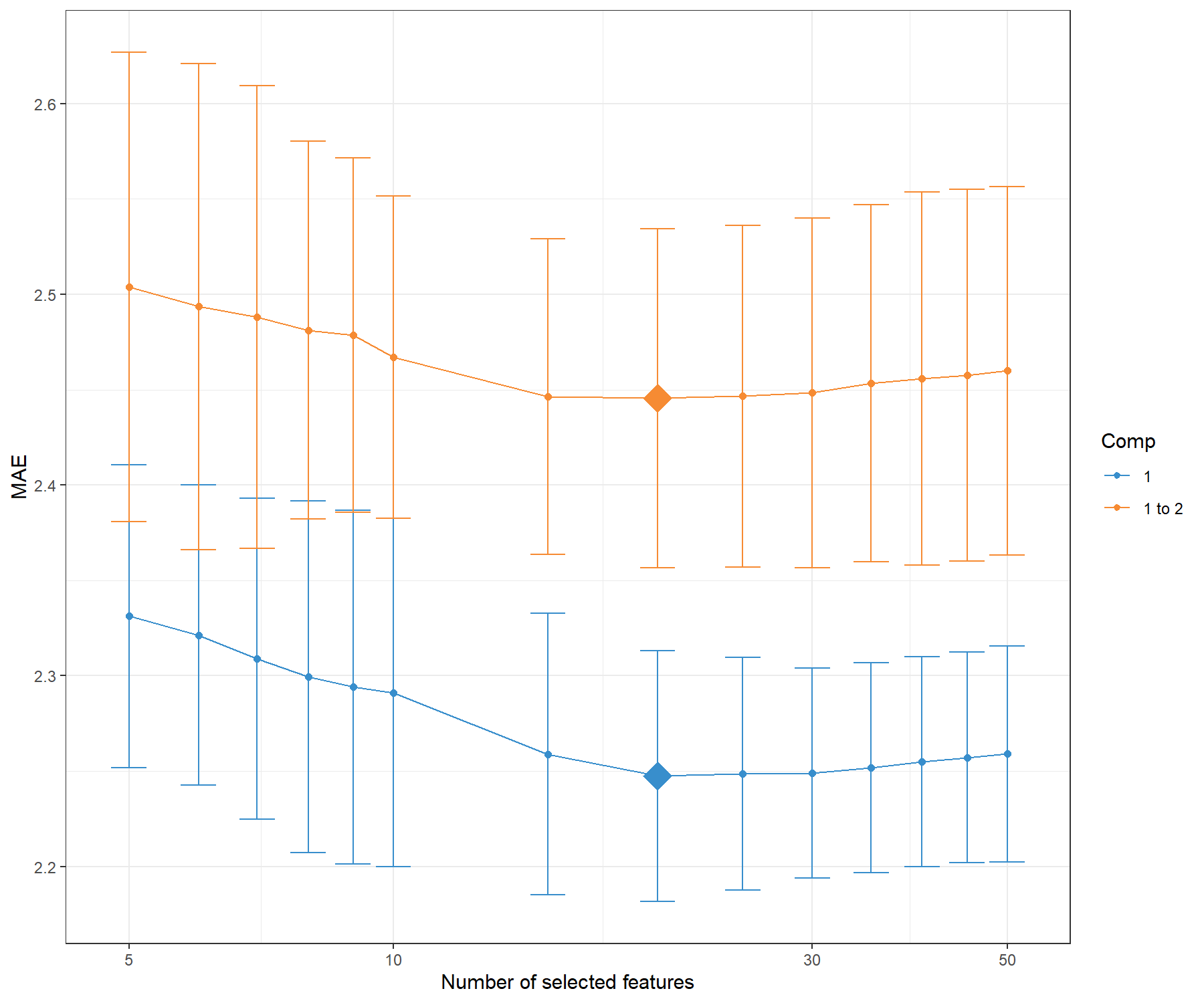
Figure 4.2: Mean Absolute Error criterion to choose the number of variables to select in PLS1, using repeated CV times for a grid of variables to select. The MAE increases with the addition of a second dimension comp 1 to 2, suggesting that only one dimension is sufficient. The optimal keepX is indicated with a diamond.
Figure 4.2 confirms that one dimension is sufficient to reach minimal MAE. Based on the tune.spls() function we extract the final parameters:
choice.ncomp <- tune.spls1.MAE$choice.ncomp$ncomp
# Optimal number of variables to select in X based on the MAE criterion
# We stop at choice.ncomp
choice.keepX <- tune.spls1.MAE$choice.keepX[1:choice.ncomp]

choice.ncomp
## [1] 1## comp1
## 20Note:
- Other criterion could have been used and may bring different results. For example, when using
measure = 'MSE, the optimalkeepXwas rather unstable, and is often smaller than when using the MAE criterion. As we have highlighted before, there is some back and forth in the analyses to choose the criterion and parameters that best fit our biological question and interpretation.
4.2.3 Final sPLS1 model
Here is our final model with the tuned parameters:
The list of genes selected on component 1 can be extracted with the command line (not output here):
We can compare the amount of explained variance for the \(\boldsymbol X\) data set based on the sPLS1 (on 1 component) versus PLS1 (that was run on 4 components during the tuning step):
##      comp1
## 0.08150917## comp1 comp2 comp3 comp4
## 0.11079101 0.14010577 0.21714518 0.06433377The amount of explained variance in \(\boldsymbol X\) is lower in sPLS1 than PLS1 for the first component. However, we will see in this case study that the Mean Squared Error Prediction is also lower (better) in sPLS1 compared to PLS1.
4.2.4 Sample plots
For further graphical outputs, we need to add a second dimension in the model, which can include the same number of keepX variables as in the first dimension. However, the interpretation should primarily focus on the first dimension. In Figure 4.3 we colour the samples according to the time of treatment and add symbols to represent the treatment dose. Recall however that such information was not included in the sPLS1 analysis.
spls1.liver.c2 <- spls(X, y, ncomp = 2, keepX = c(rep(choice.keepX, 2)),
                   mode = "regression")

plotIndiv(spls1.liver.c2,
          group = liver.toxicity$treatment$Time.Group,
          pch = as.factor(liver.toxicity$treatment$Dose.Group),
          legend = TRUE, legend.title = 'Time', legend.title.pch = 'Dose')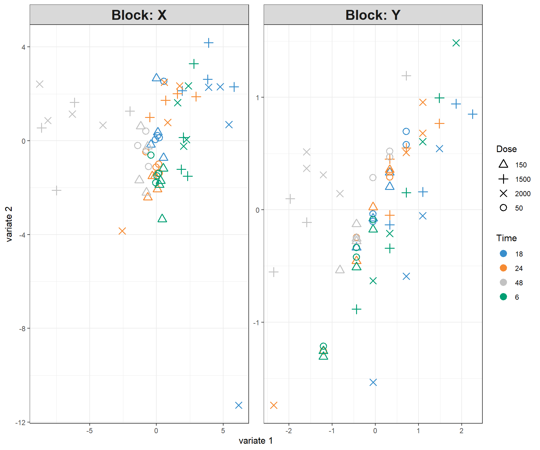
Figure 4.3: Sample plot from the PLS1 performed on the liver.toxicity data with two dimensions. Components associated to each data set (or block) are shown. Focusing only on the projection of the sample on the first component shows that the genes selected in \(\boldsymbol X\) tend to explain the 48h length of treatment vs the earlier time points. This is somewhat in agreement with the levels of the \(\boldsymbol y\) variable. However, more insight can be obtained by plotting the first components only, as shown in Figure 4.4.
The alternative is to plot the component associated to the \(\boldsymbol X\) data set (here corresponding to a linear combination of the selected genes) vs. the component associated to the \(\boldsymbol y\) variable (corresponding to the scaled \(\boldsymbol y\) variable in PLS1 with one dimension), or calculate the correlation between both components:
# Define factors for colours matching plotIndiv above
time.liver <- factor(liver.toxicity$treatment$Time.Group,
                     levels = c('18', '24', '48', '6'))
dose.liver <- factor(liver.toxicity$treatment$Dose.Group,
                     levels = c('50', '150', '1500', '2000'))
# Set up colours and symbols
col.liver <- color.mixo(time.liver)
pch.liver <- as.numeric(dose.liver)

plot(spls1.liver$variates$X, spls1.liver$variates$Y,
     xlab = 'X component', ylab = 'y component / scaled y',
     col = col.liver, pch = pch.liver)
legend('topleft', col = color.mixo(1:4), legend = levels(time.liver),
       lty = 1, title = 'Time')
legend('bottomright', legend = levels(dose.liver), pch = 1:4,
       title = 'Dose')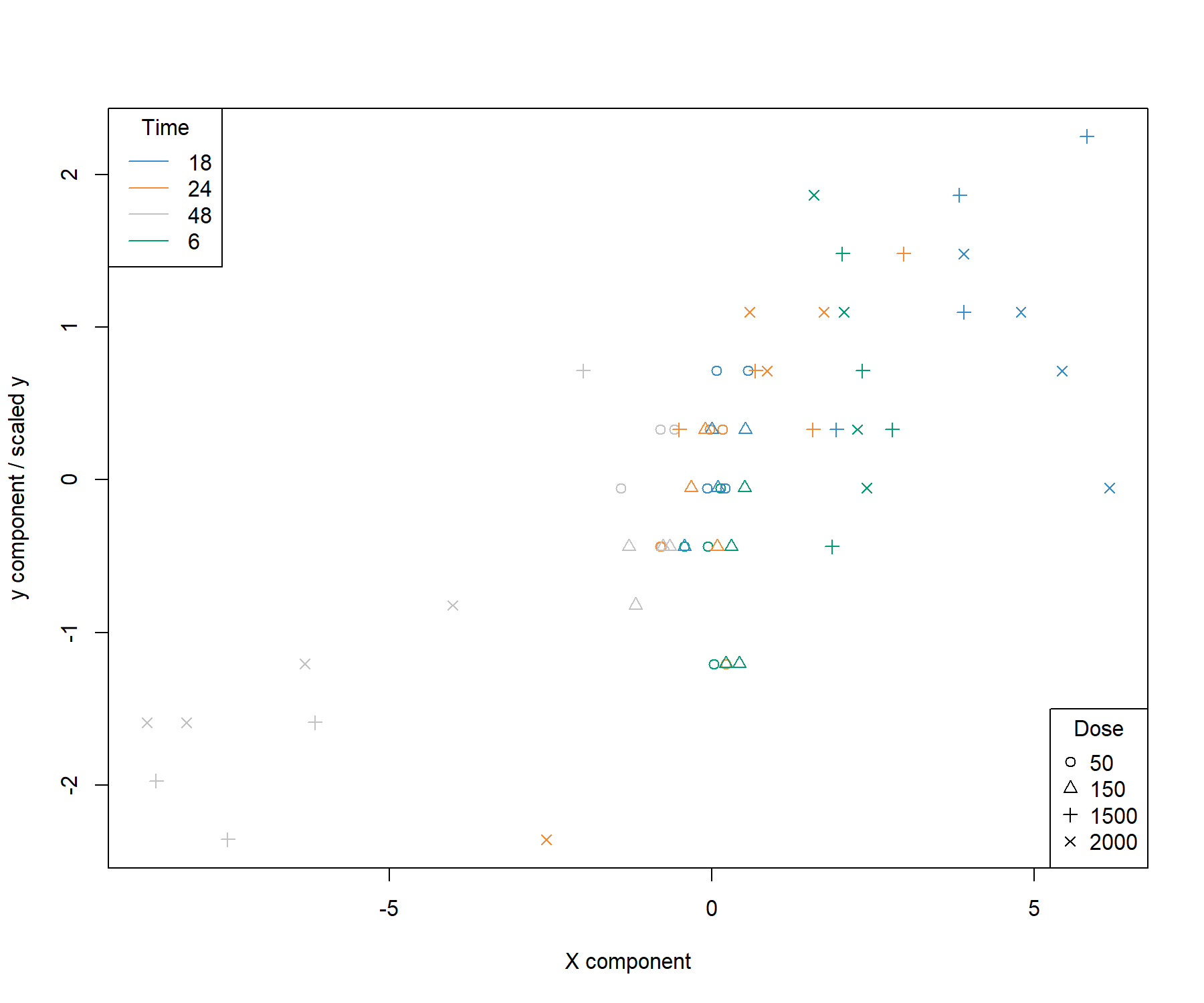
Figure 4.4: Sample plot from the sPLS1 performed on the liver.toxicity data on one dimension. A reduced representation of the 20 genes selected and combined in the \(\boldsymbol X\) component on the \(x-\)axis with respect to the \(\boldsymbol y\) component value (equivalent to the scaled values of \(\boldsymbol y\)) on the \(y-\)axis. We observe a separation between the high doses 1500 and 2000 mg/kg (symbols \(+\) and \(\times\)) at 48h and 18h while low and medium doses cluster in the middle of the plot. High doses for 6h and 18h have high scores for both components.
##           comp1
## comp1 0.7515489
Figure 4.4 is a reduced representation of a multivariate regression with PLS1. It shows that PLS1 effectively models a linear relationship between \(\boldsymbol y\) and the combination of the 20 genes selected in \(\boldsymbol X\).
4.2.5 Performance assessment of sPLS1
The performance of the final model can be assessed with the perf() function, using repeated cross-validation (CV). Because a single performance value has little meaning, we propose to compare the performances of a full PLS1 model (with no variable selection) with our sPLS1 model based on the MSEP (other criteria can be used):
set.seed(33)  # For reproducibility with this handbook, remove otherwise

# PLS1 model and performance
pls1.liver <- pls(X, y, ncomp = choice.ncomp, mode = "regression")
perf.pls1.liver <- perf(pls1.liver, validation = "Mfold", folds =10,
                   nrepeat = 5, progressBar = FALSE)
perf.pls1.liver$measures$MSEP$summary
## feature comp mean sd
## 1 Y 1 0.7296929 0.03178284# To extract values across all repeats:
# perf.pls1.liver$measures$MSEP$values
# sPLS1 performance
perf.spls1.liver <- perf(spls1.liver, validation = "Mfold", folds = 10,
nrepeat = 5, progressBar = FALSE)
perf.spls1.liver$measures$MSEP$summary## feature comp mean sd
## 1 Y 1 0.605083 0.02703475The MSEP is lower with sPLS1 compared to PLS1, indicating that the \(\boldsymbol{X}\) variables selected (listed above with selectVar()) can be considered as a good linear combination of predictors to explain \(\boldsymbol y\).
4.3 Example: PLS2 regression
PLS2 is a more complex problem than PLS1, as we are attempting to fit a linear combination of a subset of \(\boldsymbol{Y}\) variables that are maximally covariant with a combination of \(\boldsymbol{X}\) variables. The sparse variant allows for the selection of variables from both data sets.
As a reminder, here are the dimensions of the \(\boldsymbol{Y}\) matrix that includes clinical parameters associated with liver failure.
## [1] 64 104.3.1 Number of dimensions using the \(Q^2\) criterion
Similar to PLS1, we first start by tuning the number of components to select by using the perf() function and the \(Q^2\) criterion using repeated cross-validation.
tune.pls2.liver <- pls(X = X, Y = Y, ncomp = 5, mode = 'regression')

set.seed(33)  # For reproducibility with this handbook, remove otherwise
Q2.pls2.liver <- perf(tune.pls2.liver, validation = 'Mfold', folds = 10,
                      nrepeat = 5)
plot(Q2.pls2.liver, criterion = 'Q2.total')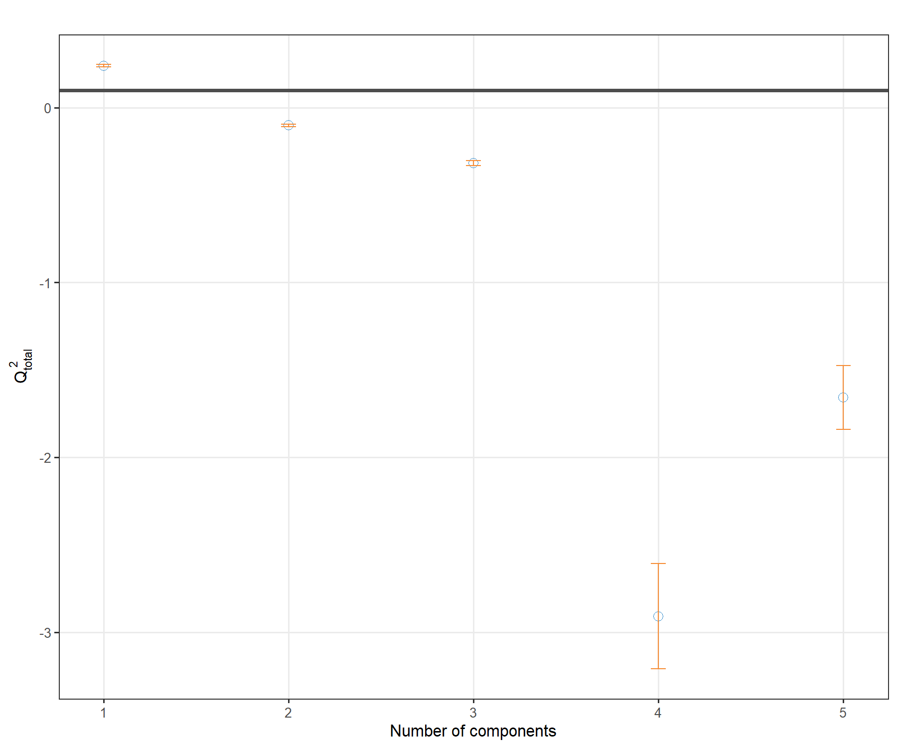
Figure 4.5: \(Q^2\) criterion to choose the number of components in PLS2. For each component added to the PLS2 model, the averaged \(Q^2\) across repeated cross-validation is shown, with the horizontal line of 0.0975 indicating the threshold below which the addition of a dimension may not be beneficial to improve accuracy.
Figure 4.5 shows that one dimension should be sufficient in PLS2. We will include a second dimension in the graphical outputs, whilst focusing our interpretation on the first dimension.
Note:
- Here we chose repeated cross-validation, however, the conclusions were similar for
nrepeat = 1.
4.3.2 Number of variables to select in both \(\boldsymbol X\) and \(\boldsymbol Y\)
Using the tune.spls() function, we can perform repeated cross-validation to obtain some indication of the number of variables to select. We show an example of code below which may take some time to run (see ?tune.spls() to use parallel computing). We had refined the grid of tested values as the tuning function tended to favour a very small signature. Hence we decided to constrain the start of the grid to 3 for a more insightful signature. Both measure = 'cor and RSS gave similar signature sizes, but this observation might differ for other case studies.
The optimal parameters can be output, along with a plot showing the tuning results, as shown in Figure 4.6:
# This code may take several min to run, parallelisation option is possible
list.keepX <- c(seq(5, 50, 5))
list.keepY <- c(3:10)

set.seed(33)  # For reproducibility with this handbook, remove otherwise
tune.spls.liver <- tune.spls(X, Y, test.keepX = list.keepX,
                             test.keepY = list.keepY, ncomp = 2,
                             nrepeat = 1, folds = 10, mode = 'regression',
                             measure = 'cor',
                            #   the following uses two CPUs for faster computation
                            # it can be commented out
                            BPPARAM = BiocParallel::SnowParam(workers = 14)
                            )

plot(tune.spls.liver)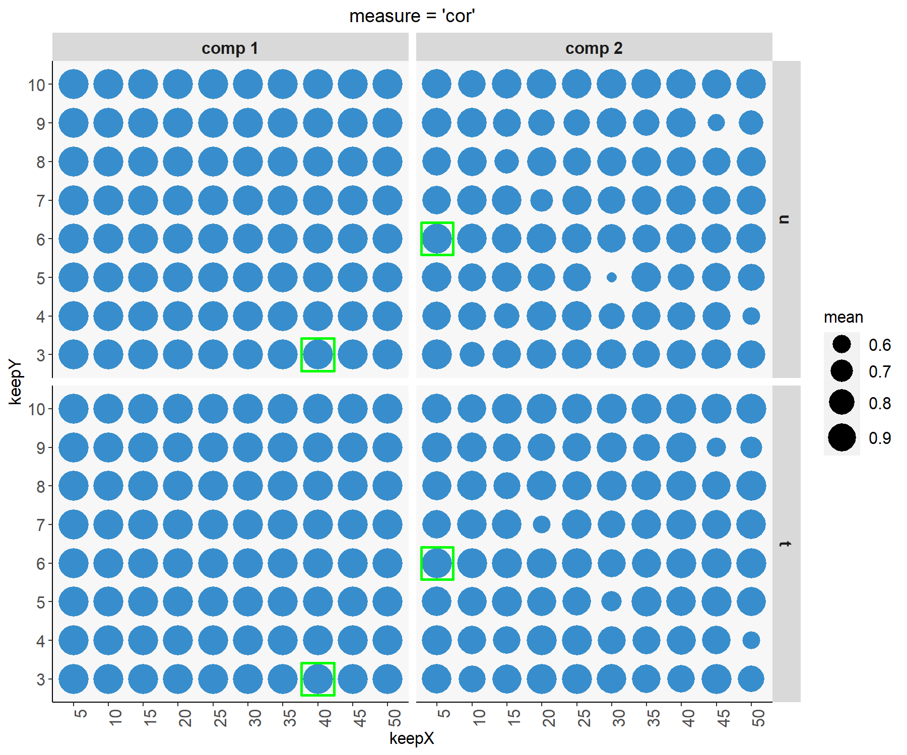
Figure 4.6: Tuning plot for sPLS2. For every grid value of keepX and keepY, the averaged correlation coefficients between the \(\boldsymbol t\) and \(\boldsymbol u\) components are shown across repeated CV, with optimal values (here corresponding to the highest mean correlation) indicated in a green square for each dimension and data set.
4.3.3 Final sPLS2 model
Here is our final model with the tuned parameters for our sPLS2 regression analysis. Note that if you choose to not run the tuning step, you can still decide to set the parameters of your choice here.
#Optimal parameters
choice.keepX <- tune.spls.liver$choice.keepX
choice.keepY <- tune.spls.liver$choice.keepY
choice.ncomp <- length(choice.keepX)

spls2.liver <- spls(X, Y, ncomp = choice.ncomp,
                   keepX = choice.keepX,
                   keepY = choice.keepY,
                   mode = "regression")
4.3.3.1 Numerical outputs
The amount of explained variance can be extracted for each dimension and each data set:
## $X
##      comp1      comp2
## 0.19672006 0.08124091
##
## $Y
##     comp1     comp2
## 0.3650005 0.2173234
4.3.3.2 Importance variables
The selected variables can be extracted from the selectVar() function, for example for the \(\boldsymbol X\) data set, with either their $name or the loading $value (not output here):
The VIP measure is exported for all variables in \(\boldsymbol X\), here we only subset those that were selected (non null loading value) for component 1:
vip.spls2.liver <- vip(spls2.liver)
# just a head
head(vip.spls2.liver[selectVar(spls2.liver, comp = 1)$X$name,1])
## A_42_P620915 A_43_P14131 A_42_P578246 A_43_P11724 A_42_P840776 A_42_P675890
## 22.40370 20.66500 15.29651 14.68876 13.81364 13.12778The (full) output shows that most \(\boldsymbol X\) variables that were selected are important for explaining \(\boldsymbol Y\), since their VIP is greater than 1.
We can examine how frequently each variable is selected when we subsample the data using the perf() function to measure how stable the signature is (Table 4.1). The same could be output for other components and the \(\boldsymbol Y\) data set.
perf.spls2.liver <- perf(spls2.liver, validation = 'Mfold', folds = 10, nrepeat = 5)
# Extract stability
stab.spls2.liver.comp1 <- perf.spls2.liver$features$stability.X$comp1
# Averaged stability of the X selected features across CV runs, as shown in Table
stab.spls2.liver.comp1[1:choice.keepX[1]]

# We extract the stability measures of only the variables selected in spls2.liver
extr.stab.spls2.liver.comp1 <- stab.spls2.liver.comp1[selectVar(spls2.liver,
comp =1)$X$name]| x |
|---|
| 0.84 |
| 0.94 |
| 0.74 |
| 0.78 |
| 0.80 |
| 0.82 |
| 0.64 |
| 0.62 |
| 0.50 |
| 0.40 |
| NA |
| NA |
| NA |
| NA |
| NA |
| NA |
| NA |
| NA |
| NA |
| NA |
We recommend to mainly focus on the interpretation of the most stable selected variables (with a frequency of occurrence greater than 0.8).
4.3.3.3 Graphical outputs
Using the plotIndiv() function, we display the sample and metadata information using the arguments group (colour) and pch (symbol) to better understand the similarities between samples modelled with sPLS2.
The plot on the left hand side corresponds to the projection of the samples from the \(\boldsymbol X\) data set (gene expression) and the plot on the right hand side the \(\boldsymbol Y\) data set (clinical variables).
plotIndiv(spls2.liver, ind.names = FALSE,
          group = liver.toxicity$treatment$Time.Group,
          pch = as.factor(liver.toxicity$treatment$Dose.Group),
          col.per.group = color.mixo(1:4),
          legend = TRUE, legend.title = 'Time',
          legend.title.pch = 'Dose')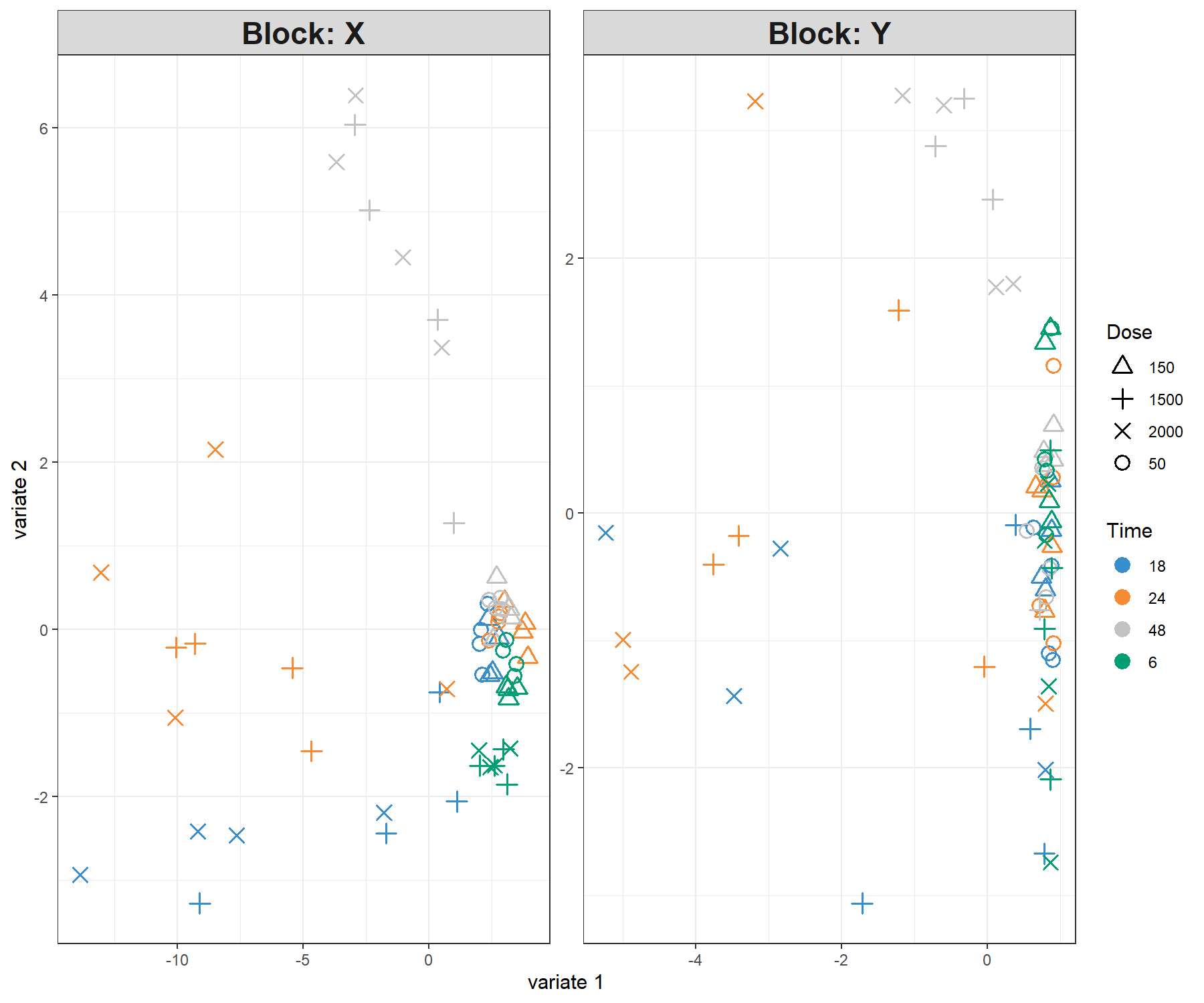
Figure 4.7: Sample plot for sPLS2 performed on the liver.toxicity data. Samples are projected into the space spanned by the components associated to each data set (or block). We observe some agreement between the data sets, and a separation of the 1500 and 2000 mg doses (\(+\) and \(\times\)) in the 18h, 24h time points, and the 48h time point.
From Figure 4.7 we observe an effect of low vs. high doses of acetaminophen (component 1) as well as time of necropsy (component 2). There is some level of agreement between the two data sets, but it is not perfect!
If you run an sPLS with three dimensions, you can consider the 3D plotIndiv() by specifying style = '3d in the function.
The plotArrow() option is useful in this context to visualise the level of agreement between data sets. Recall that in this plot:
- The start of the arrow indicates the location of the sample in the \(\boldsymbol X\) projection space,
- The end of the arrow indicates the location of the (same) sample in the \(\boldsymbol Y\) projection space,
- Long arrows indicate a disagreement between the two projected spaces.
plotArrow(spls2.liver, ind.names = FALSE,
          group = liver.toxicity$treatment$Time.Group,
          col.per.group = color.mixo(1:4),
          legend.title = 'Time.Group')
Figure 4.8: Arrow plot from the sPLS2 performed on the liver.toxicity data. The start of the arrow indicates the location of a given sample in the space spanned by the components associated to the gene data set, and the tip of the arrow the location of that same sample in the space spanned by the components associated to the clinical data set. We observe large shifts for 18h, 24 and 48h samples for the high doses, however the clusters of samples remain the same, as we observed in Figure 4.7.
In Figure 4.8 we observe that specific groups of samples seem to be located far apart from one data set to the other, indicating a potential discrepancy between the information extracted. However the groups of samples according to either dose or treatment remains similar.
Correlation circle plots illustrate the correlation structure between the two types of variables. To display only the name of the variables from the \(\boldsymbol{Y}\) data set, we use the argument var.names = c(FALSE, TRUE) where each boolean indicates whether the variable names should be output for each data set. We also modify the size of the font, as shown in Figure 4.9:
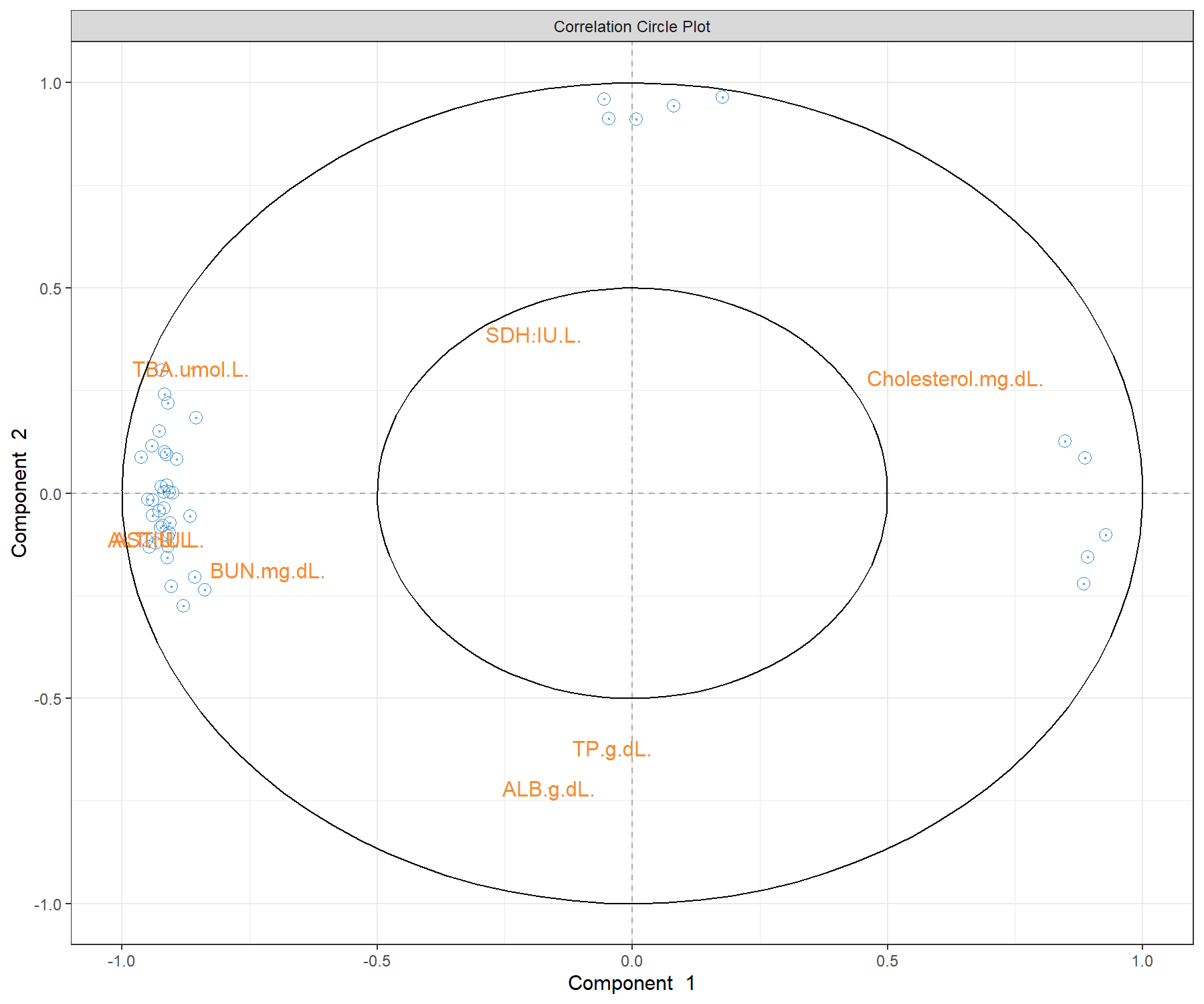
Figure 4.9: Correlation circle plot from the sPLS2 performed on the liver.toxicity data. The plot highlights correlations within selected genes (their names are not indicated here), within selected clinical parameters, and correlations between genes and clinical parameters on each dimension of sPLS2. This plot should be interpreted in relation to Figure 4.7 to better understand how the expression levels of these molecules may characterise specific sample groups.
To display variable names that are different from the original data matrix (e.g. gene ID), we set the argument var.names as a list for each type of label, with geneBank ID for the \(\boldsymbol X\) data set, and TRUE for the \(\boldsymbol Y\) data set:
plotVar(spls2.liver,
        var.names = list(X.label = liver.toxicity$gene.ID[,'geneBank'],
        Y.label = TRUE), cex = c(3,4))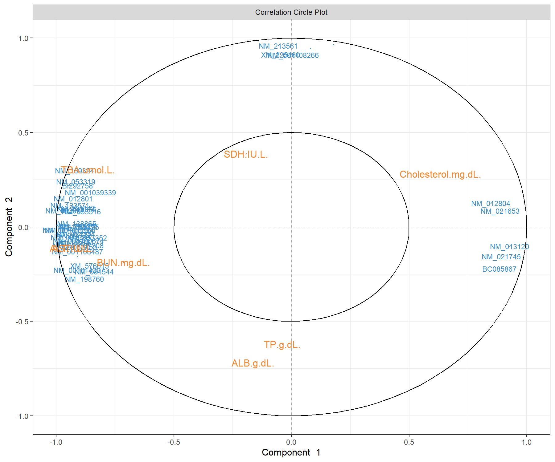
Figure 4.10: Correlation circle plot from the sPLS2 performed on the liver.toxicity data. A variant of Figure 4.9 with gene names that are available in $gene.ID (Note: some gene names are missing).
The correlation circle plots highlight the contributing variables that, together, explain the covariance between the two data sets. In addition, specific subsets of molecules can be further investigated, and in relation with the sample group they may characterise. The latter can be examined with additional plots (for example boxplots with respect to known sample groups and expression levels of specific variables, as we showed in the PCA case study previously. The next step would be to examine the validity of the biological relationship between the clusters of genes with some of the clinical variables that we observe in this plot.
A 3D plot is also available in plotVar() with the argument style = '3d. It requires an sPLS2 model with at least three dimensions.
Other plots are available to complement the information from the correlation circle plots, such as Relevance networks and Clustered Image Maps (CIMs), as described in Module 2.
The network in sPLS2 displays only the variables selected by sPLS, with an additional cutoff similarity value argument (absolute value between 0 and 1) to improve interpretation. Because Rstudio sometimes struggles with the margin size of this plot, we can either launch X11() prior to plotting the network, or use the arguments save and name.save as shown below:
# Define red and green colours for the edges
color.edge <- color.GreenRed(50)

# X11()  # To open a new window for Rstudio
network(spls2.liver, comp = 1:2,
        cutoff = 0.7,
        shape.node = c("rectangle", "circle"),
        color.node = c("cyan", "pink"),
        color.edge = color.edge,
        # To save the plot, unotherwise:
        # save = 'pdf', name.save = 'network_liver'
        )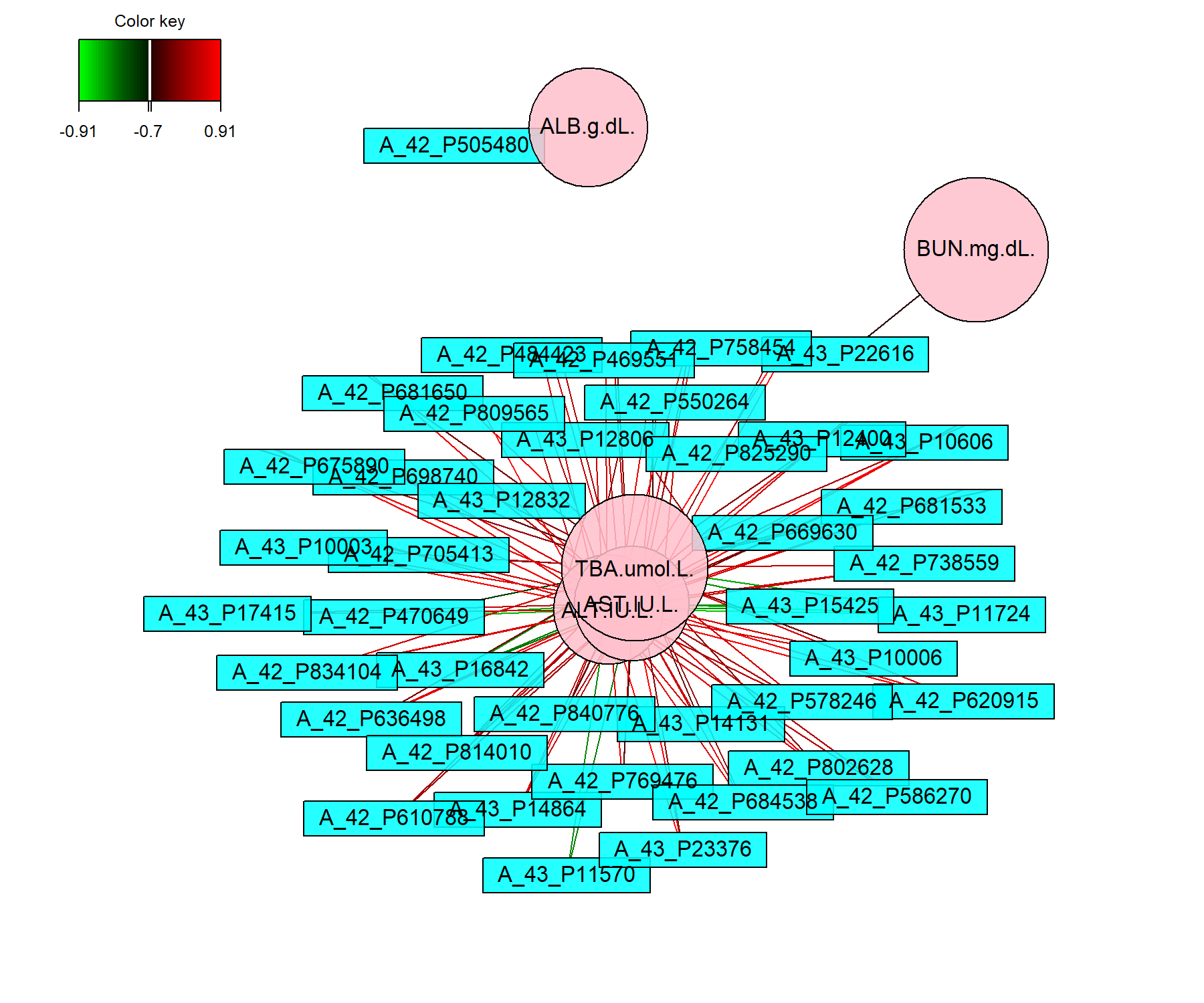
Figure 4.11: Network representation from the sPLS2 performed on the liver.toxicity data. The networks are bipartite, where each edge links a gene (rectangle) to a clinical variable (circle) node, according to a similarity matrix described in Module 2. Only variables selected by sPLS2 on the two dimensions are represented and are further filtered here according to a cutoff argument (optional).
Figure 4.11 shows two distinct groups of variables. The first cluster groups four clinical parameters that are mostly positively associated with selected genes. The second group includes one clinical parameter negatively associated with other selected genes. These observations are similar to what was observed in the correlation circle plot in Figure 4.9.
Note:
- Whilst the edges and nodes in the network do not change, the appearance might be different from one run to another as it relies on a random process to use the space as best as possible (using the
igraphR package Csardi, Nepusz, et al. (2006)).
The Clustered Image Map also allows us to visualise correlations between variables. Here we choose to represent the variables selected on the two dimensions and we save the plot as a pdf figure.
# X11()  # To open a new window if the graphic is too large
cim(spls2.liver, comp = 1:2, xlab = "clinic", ylab = "genes",
    # To save the plot, uncomment:
    # save = 'pdf', name.save = 'cim_liver'
    )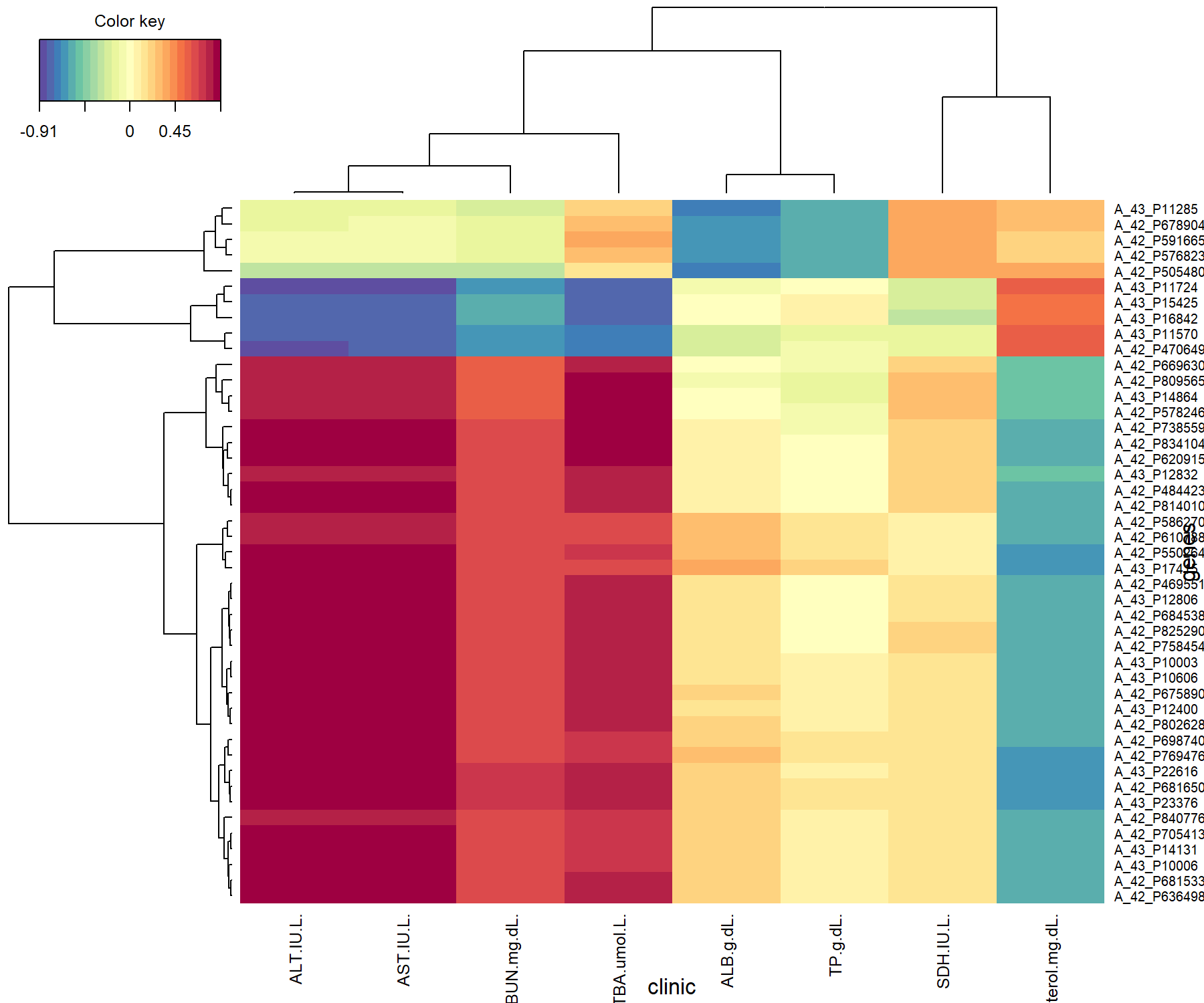
Figure 4.12: Clustered Image Map from the sPLS2 performed on the liver.toxicity data. The plot displays the similarity values (as described in Module 2) between the \(\boldsymbol X\) and \(\boldsymbol Y\) variables selected across two dimensions, and clustered with a complete Euclidean distance method.
The CIM in Figure 4.12 shows that the clinical variables can be separated into three clusters, each of them either positively or negatively associated with two groups of genes. This is similar to what we have observed in Figure 4.9. We would give a similar interpretation to the relevance network, had we also used a cutoff threshold in cim().
Note:
- A biplot for PLS objects is also available.
4.3.3.4 Performance
To finish, we assess the performance of sPLS2. As an element of comparison, we consider sPLS2 and PLS2 that includes all variables, to give insights into the different methods.
# Comparisons of final models (PLS, sPLS)

## PLS
pls.liver <- pls(X, Y, mode = 'regression', ncomp = 2)
perf.pls.liver <-  perf(pls.liver, validation = 'Mfold', folds = 10,
                        nrepeat = 5)

## Performance for the sPLS model ran earlier
perf.spls.liver <-  perf(spls2.liver, validation = 'Mfold', folds = 10,
nrepeat = 5)plot(c(1,2), perf.pls.liver$measures$cor.upred$summary$mean,
col = 'blue', pch = 16,
ylim = c(0.6,1), xaxt = 'n',
xlab = 'Component', ylab = 't or u Cor',
main = 's/PLS performance based on Correlation')
axis(1, 1:2) # X-axis label
points(perf.pls.liver$measures$cor.tpred$summary$mean, col = 'red', pch = 16)
points(perf.spls.liver$measures$cor.upred$summary$mean, col = 'blue', pch = 17)
points(perf.spls.liver$measures$cor.tpred$summary$mean, col = 'red', pch = 17)
legend('bottomleft', col = c('blue', 'red', 'blue', 'red'),
pch = c(16, 16, 17, 17), c('u PLS', 't PLS', 'u sPLS', 't sPLS'))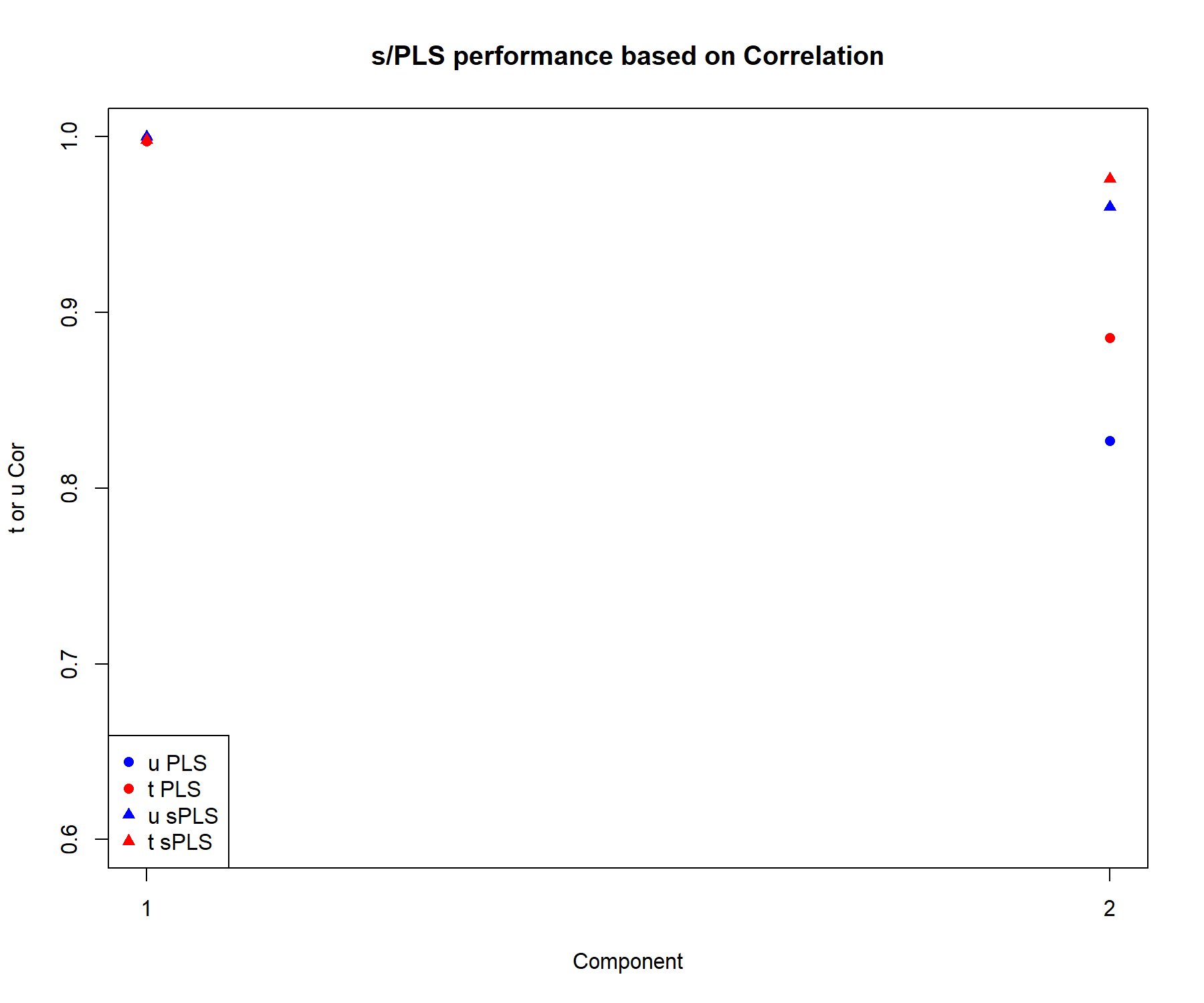
Figure 4.13: Comparison of the performance of PLS2 and sPLS2, based on the correlation between the actual and predicted components \(\boldsymbol{t,u}\) associated to each data set for each component.
We extract the correlation between the actual and predicted components \(\boldsymbol{t,u}\) associated to each data set in Figure 4.13. The correlation remains high on the first dimension, even when variables are selected. On the second dimension the correlation coefficients are equivalent or slightly lower in sPLS compared to PLS. Overall this performance comparison indicates that the variable selection in sPLS still retains relevant information compared to a model that includes all variables.
Note:
- Had we run a similar procedure but based on the RSS, we would have observed a lower RSS for sPLS compared to PLS.