5 PLS-DA on the SRBCT case study
The Small Round Blue Cell Tumours (SRBCT) data set from (Khan et al. 2001) includes the expression levels of 2,308 genes measured on 63 samples. The samples are divided into four classes: 8 Burkitt Lymphoma (BL), 23 Ewing Sarcoma (EWS), 12 neuroblastoma (NB), and 20 rhabdomyosarcoma (RMS). The data are directly available in a processed and normalised format from the mixOmics package and contains the following:
$gene: A data frame with 63 rows and 2,308 columns. These are the expression levels of 2,308 genes in 63 subjects,$class: A vector containing the class of tumour for each individual (4 classes in total),$gene.name: A data frame with 2,308 rows and 2 columns containing further information on the genes.
More details can be found in ?srbct. We will illustrate PLS-DA and sPLS-DA which are suited for large biological data sets where the aim is to identify molecular signatures, as well as classify samples. We will analyse the gene expression levels of srbct$gene to discover which genes may best discriminate the 4 groups of tumours.
5.1 Load the data
We first load the data from the package. We then set up the data so that \(\boldsymbol X\) is the gene expression matrix and \(\boldsymbol y\) is the factor indicating sample class membership. \(\boldsymbol y\) will be transformed into a dummy matrix \(\boldsymbol Y\) inside the function. We also check that the dimensions are correct and match both \(\boldsymbol X\) and \(\boldsymbol y\):
library(mixOmics)
data(srbct)
X <- srbct$gene

# Outcome y that will be internally coded as dummy:
Y <- srbct$class
dim(X); length(Y)
## [1] 63 2308
## [1] 63## EWS BL NB RMS
## 23 8 12 205.2 Example: PLS-DA
5.2.1 Initial exploration with PCA
As covered in Module 3, PCA is a useful tool to explore the gene expression data and to assess for sample similarities between tumour types. Remember that PCA is an unsupervised approach, but we can colour the samples by their class to assist in interpreting the PCA (Figure 5.1). Here we center (default argument) and scale the data:
pca.srbct <- pca(X, ncomp = 3, scale = TRUE)

plotIndiv(pca.srbct, group = srbct$class, ind.names = FALSE,
          legend = TRUE,
          title = 'SRBCT, PCA comp 1 - 2')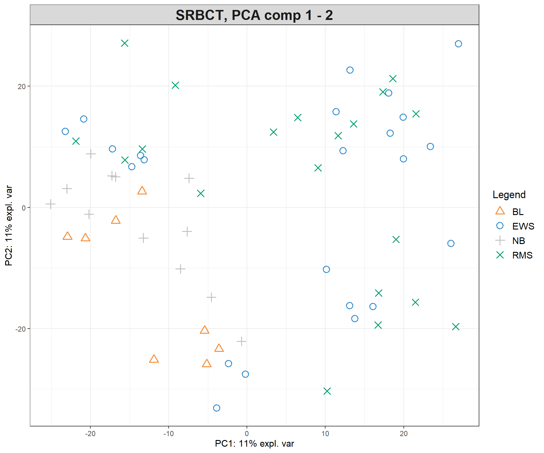
Figure 5.1: Preliminary (unsupervised) analysis with PCA on the SRBCT gene expression data. Samples are projected into the space spanned by the principal components 1 and 2. The tumour types are not clustered, meaning that the major source of variation cannot be explained by tumour types. Instead, samples seem to cluster according to an unknown source of variation.
We observe almost no separation between the different tumour types in the PCA sample plot, with perhaps the exception of the NB samples that tend to cluster with other samples. This preliminary exploration teaches us two important findings:
- The major source of variation is not attributable to tumour type, but an unknown source (we tend to observe clusters of samples but those are not explained by tumour type).
- We need a more ‘directed’ (supervised) analysis to separate the tumour types, and we should expect that the amount of variance explained by the dimensions in PLS-DA analysis will be small.
5.2.2 Number of components in PLS-DA
The perf() function evaluates the performance of PLS-DA - i.e., its ability to rightly classify ‘new’ samples into their tumour category using repeated cross-validation. We initially choose a large number of components (here ncomp = 10) and assess the model as we gradually increase the number of components. Here we use 3-fold CV repeated 10 times. In Module 2, we provided further guidelines on how to choose the folds and nrepeat parameters:
plsda.srbct <- plsda(X,Y, ncomp = 10)

set.seed(30) # For reproducibility with this handbook, remove otherwise
perf.plsda.srbct <- perf(plsda.srbct, validation = 'Mfold', folds = 3,
                  progressBar = FALSE,  # Set to TRUE to track progress
                  nrepeat = 10)         # We suggest nrepeat = 50

plot(perf.plsda.srbct, sd = TRUE, legend.position = 'horizontal')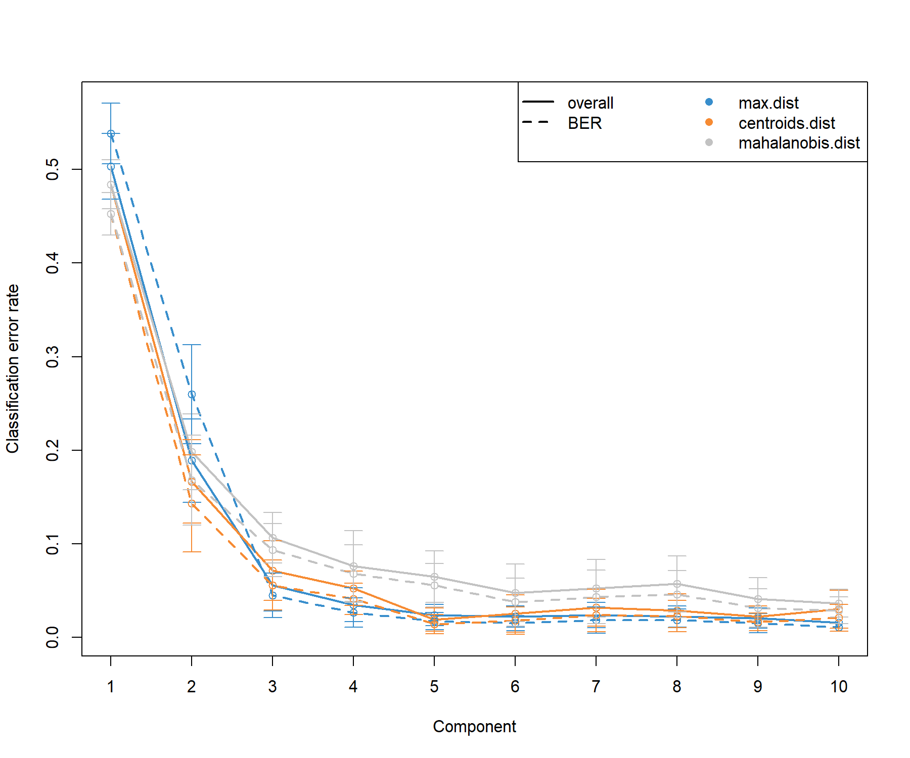
Figure 5.2: Tuning the number of components in PLS-DA on the SRBCT gene expression data. For each component, repeated cross-validation (10 \(\times 3-\)fold CV) is used to evaluate the PLS-DA classification performance (overall and balanced error rate BER), for each type of prediction distance; max.dist, centroids.dist and mahalanobis.dist. Bars show the standard deviation across the repeated folds. The plot shows that the error rate reaches a minimum from 3 components.
From the classification performance output presented in Figure 5.2, we observe that:
There are some slight differences between the overall and balanced error rates (BER) with BER > overall, suggesting that minority classes might be ignored from the classification task when considering the overall performance (
summary(Y)shows that BL only includes 8 samples). In general the trend is the same, however, and for further tuning with sPLS-DA we will consider the BER.The error rate decreases and reaches a minimum for
ncomp = 3for themax.distdistance. These parameters will be included in further analyses.
Notes:
- PLS-DA is an iterative model, where each component is orthogonal to the previous and gradually aims to build more discrimination between sample classes. We should always regard a final PLS-DA (with specified
ncomp) as a ‘compounding’ model (i.e. PLS-DA with component 3 includes the trained model on the previous two components). - We advise to use at least 50 repeats, and choose the number of folds that are appropriate for the sample size of the data set, as shown in Figure 5.2).
Additional numerical outputs from the performance results are listed and can be reported as performance measures (not output here):
5.2.3 Final PLS-DA model
We now run our final PLS-DA model that includes three components:
We output the sample plots for the dimensions of interest (up to three). By default, the samples are coloured according to their class membership. We also add confidence ellipses (ellipse = TRUE, confidence level set to 95% by default, see the argument ellipse.level) in Figure 5.3. A 3D plot could also be insightful (use the argument type = '3D').
plotIndiv(final.plsda.srbct, ind.names = FALSE, legend=TRUE,
          comp=c(1,2), ellipse = TRUE,
          title = 'PLS-DA on SRBCT comp 1-2',
X.label = 'PLS-DA comp 1', Y.label = 'PLS-DA comp 2')plotIndiv(final.plsda.srbct, ind.names = FALSE, legend=TRUE,
comp=c(2,3), ellipse = TRUE,
title = 'PLS-DA on SRBCT comp 2-3',
X.label = 'PLS-DA comp 2', Y.label = 'PLS-DA comp 3')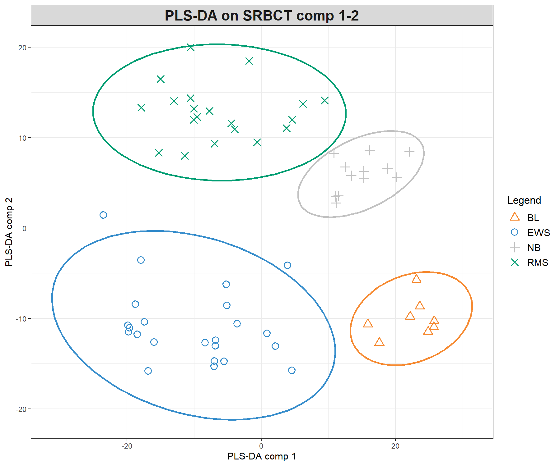
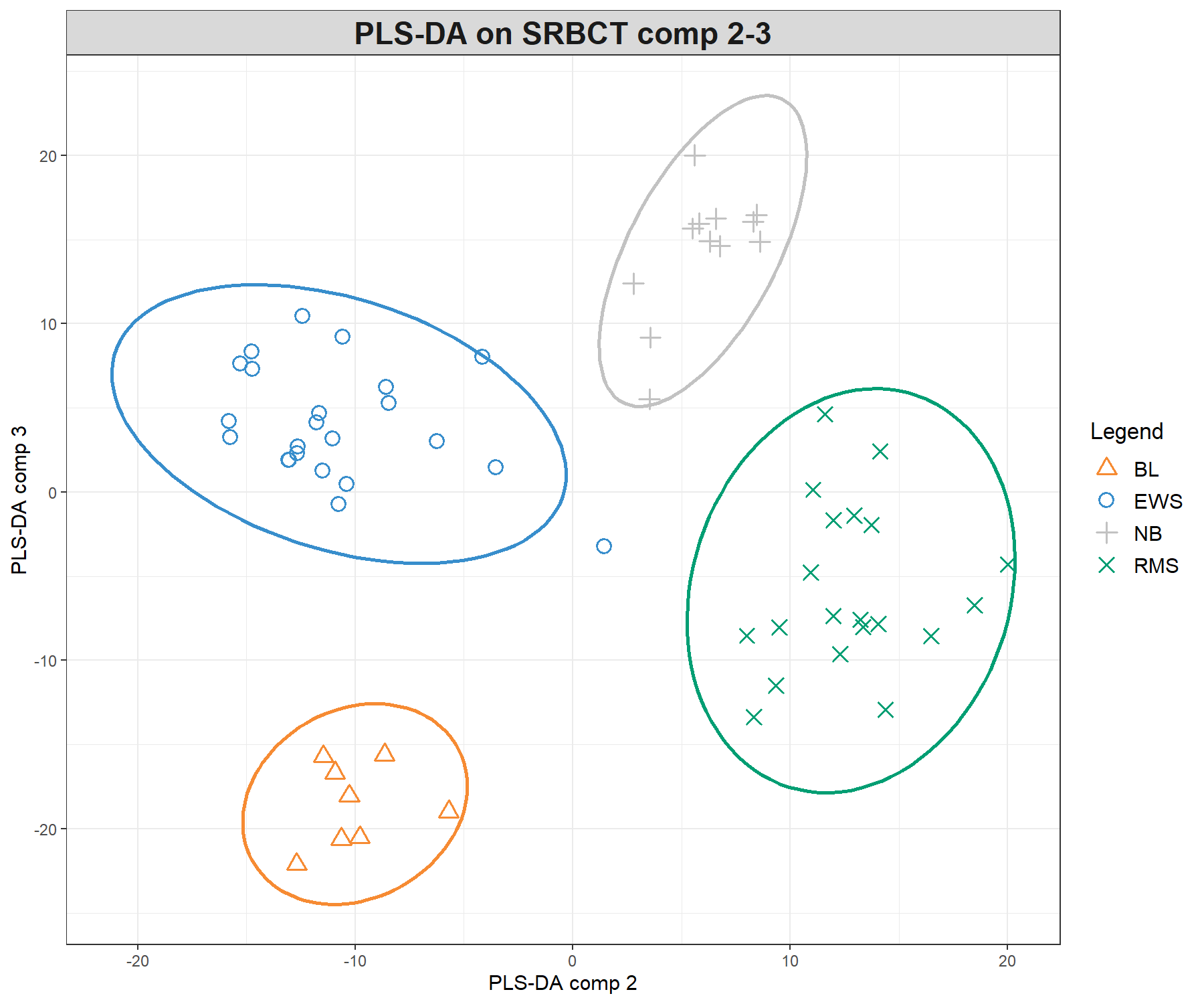
Figure 5.3: Sample plots from PLS-DA performed on the SRBCT gene expression data. Samples are projected into the space spanned by the first three components. (a) Components 1 and 2 and (b) Components 1 and 3. Samples are coloured by their tumour subtypes. Component 1 discriminates RMS + EWS vs. NB + BL, component 2 discriminates RMS + NB vs. EWS + BL, while component 3 discriminates further the NB and BL groups. It is the combination of all three components that enables us to discriminate all classes.
We can observe improved clustering according to tumour subtypes, compared with PCA. This is to be expected since the PLS-DA model includes the class information of each sample. We observe some discrimination between the NB and BL samples vs. the others on the first component (x-axis), and EWS and RMS vs. the others on the second component (y-axis). From the plotIndiv() function, the axis labels indicate the amount of variation explained per component. However, the interpretation of this amount is not as important as in PCA, as PLS-DA aims to maximise the covariance between components associated to \(\boldsymbol X\) and \(\boldsymbol Y\), rather than the variance \(\boldsymbol X\).
5.2.4 Classification performance
We can rerun a more extensive performance evaluation with more repeats for our final model:
set.seed(30) # For reproducibility with this handbook, remove otherwise
perf.final.plsda.srbct <- perf(final.plsda.srbct, validation = 'Mfold',
                               folds = 3,
                               progressBar = FALSE, # TRUE to track progress
                               nrepeat = 10) # we recommend 50
Retaining only the BER and the max.dist, numerical outputs of interest include the final overall performance for 3 components:
##      comp1      comp2      comp3
## 0.57773551 0.24157609 0.06298913
As well as the error rate per class across each component:
##         comp1      comp2      comp3
## EWS 0.2826087 0.09130435 0.08695652
## BL  0.8750000 0.50000000 0.00000000
## NB  0.3333333 0.32500000 0.05000000
## RMS 0.8200000 0.05000000 0.11500000
From this output, we can see that the first component tends to classify EWS and NB better than the other classes. As components 2 and then 3 are added, the classification improves for all classes. However we see a slight increase in classification error in component 3 for EWS and RMS while BL is perfectly classified. A permutation test could also be conducted to conclude about the significance of the differences between sample groups, but is not currently implemented in the package.
5.2.5 Background prediction
A prediction background can be added to the sample plot by calculating a background surface first, before overlaying the sample plot (Figure 5.4, see Extra Reading material, or ?background.predict). We give an example of the code below based on the maximum prediction distance:
background.max <- background.predict(final.plsda.srbct,
                                     comp.predicted = 2,
                                     dist = 'max.dist')

plotIndiv(final.plsda.srbct, comp = 1:2, group = srbct$class,
          ind.names = FALSE, title = 'Maximum distance',
          legend = TRUE,  background = background.max)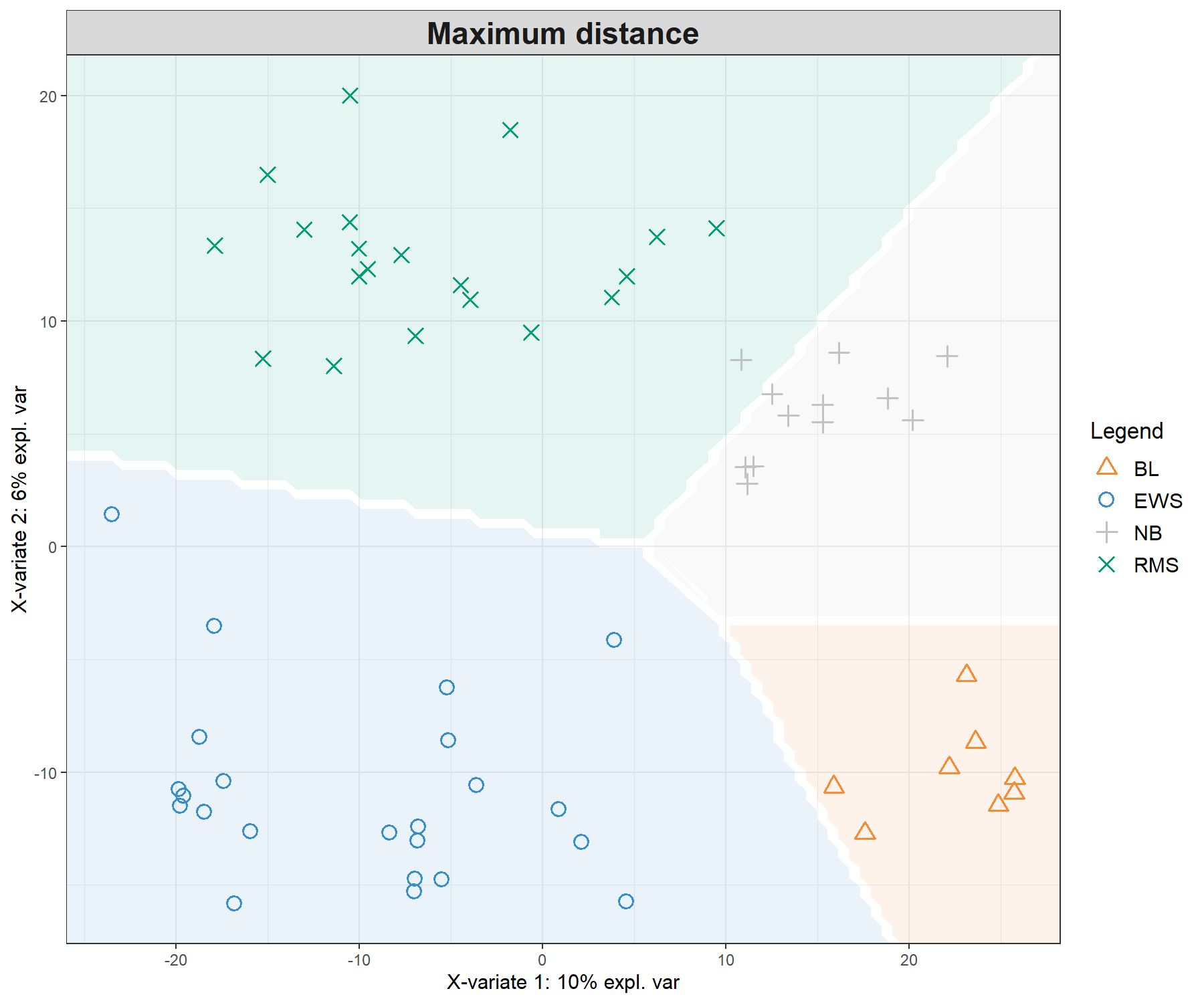
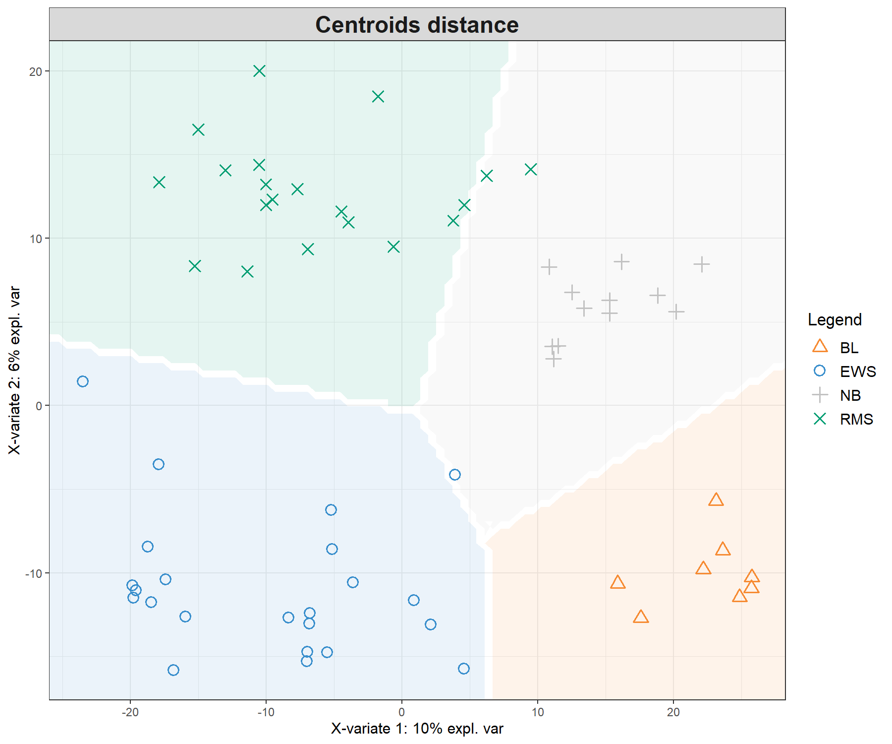
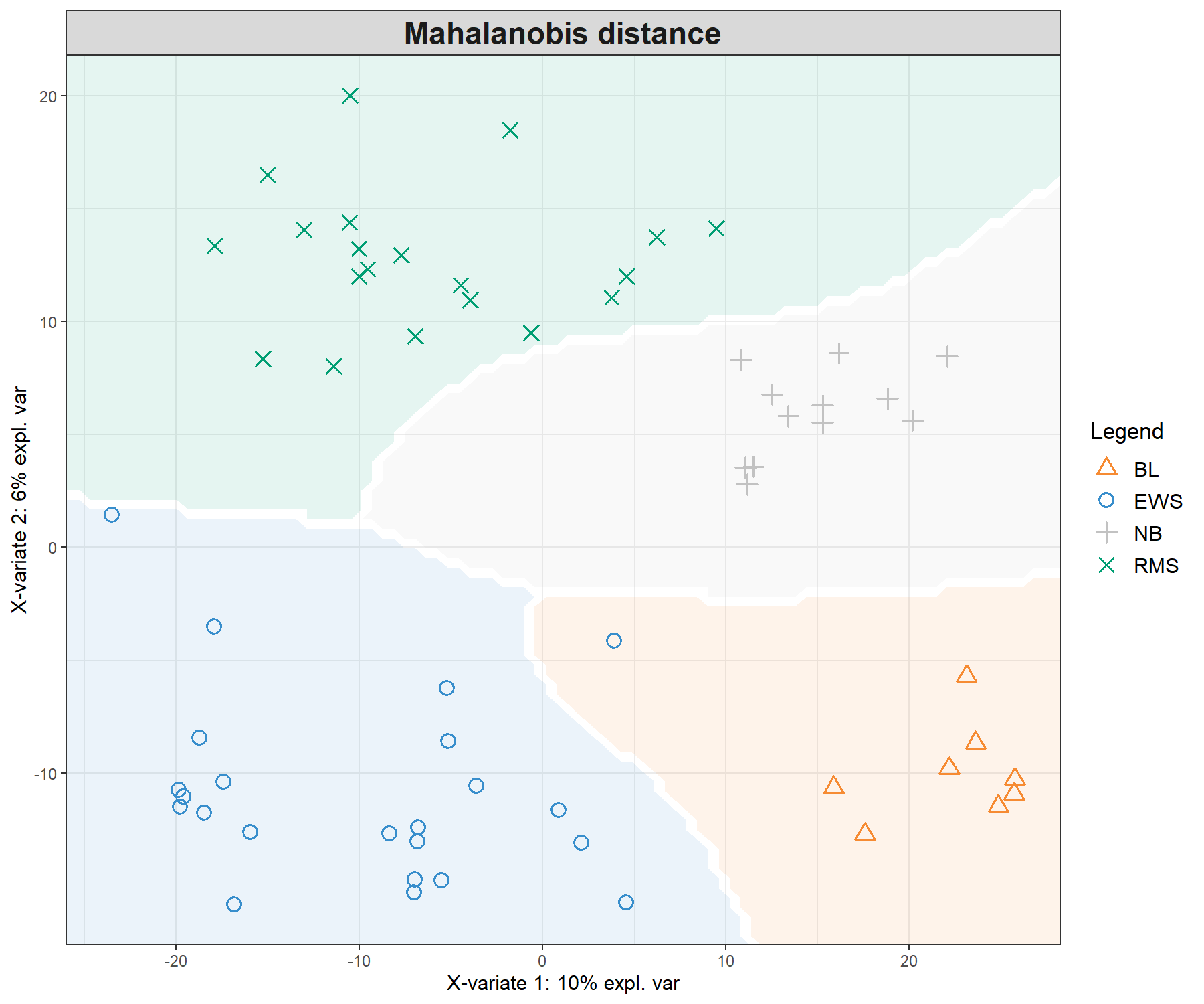
Figure 5.4: Sample plots from PLS-DA on the SRBCT gene expression data and prediction areas based on prediction distances. From our usual sample plot, we overlay a background prediction area based on permutations from the first two PLS-DA components using the three different types of prediction distances. The outputs show how the prediction distance can influence the quality of the prediction, with samples projected into a wrong class area, and hence resulting in predicted misclassification. (Currently, the prediction area background can only be calculated for the first two components).
Figure 5.4 shows the differences in prediction according to the prediction distance, and can be used as a further diagnostic tool for distance choice. It also highlights the characteristics of the distances. For example the max.dist is a linear distance, whereas both centroids.dist and mahalanobis.dist are non linear. Our experience has shown that as discrimination of the classes becomes more challenging, the complexity of the distances (from maximum to Mahalanobis distance) should increase, see details in the Extra reading material.
5.3 Example: sPLS-DA
In high-throughput experiments, we expect that many of the 2308 genes in \(\boldsymbol X\) are noisy or uninformative to characterise the different classes. An sPLS-DA analysis will help refine the sample clusters and select a small subset of variables relevant to discriminate each class.
5.3.1 Number of variables to select
We estimate the classification error rate with respect to the number of selected variables in the model with the function tune.splsda(). The tuning is being performed one component at a time inside the function and the optimal number of variables to select is automatically retrieved after each component run, as described in Module 2.
Previously, we determined the number of components to be ncomp = 3 with PLS-DA. Here we set ncomp = 4 to further assess if this would be the case for a sparse model, and use 5-fold cross validation repeated 10 times. We also choose the maximum prediction distance.
Note:
- For a thorough tuning step, the following code should be repeated 10 - 50 times and the error rate is averaged across the runs. You may obtain slightly different results below for this reason.
We first define a grid of keepX values. For example here, we define a fine grid at the start, and then specify a coarser, larger sequence of values:
# Grid of possible keepX values that will be tested for each comp
list.keepX <- c(1:10,  seq(20, 100, 10))
list.keepX
## [1] 1 2 3 4 5 6 7 8 9 10 20 30 40 50 60 70 80 90 100# This chunk takes ~ 2 min to run
# Some convergence issues may arise but it is ok as this is run on CV folds
tune.splsda.srbct <- tune.splsda(X, Y, ncomp = 4, validation = 'Mfold',
folds = 5, dist = 'max.dist',
test.keepX = list.keepX, nrepeat = 10)The following command line will output the mean error rate for each component and each tested keepX value given the past (tuned) components.
# Just a head of the classification error rate per keepX (in rows) and comp
head(tune.splsda.srbct$error.rate)
## comp1 comp2 comp3 comp4
## 1 0.5998279 0.3013134 0.05189312 0.007844203
## 2 0.5503261 0.3068207 0.04305254 0.007844203
## 3 0.5395652 0.2879348 0.03409420 0.005923913
## 4 0.5282790 0.2855978 0.03263587 0.005923913
## 5 0.5198551 0.2765036 0.03363225 0.007010870
## 6 0.5198551 0.2744203 0.03050725 0.008260870When we examine each individual row, this output globally shows that the classification error rate continues to decrease after the third component in sparse PLS-DA.
We display the mean classification error rate on each component, bearing in mind that each component is conditional on the previous components calculated with the optimal number of selected variables. The diamond in Figure 5.5 indicates the best keepX value to achieve the lowest error rate per component.
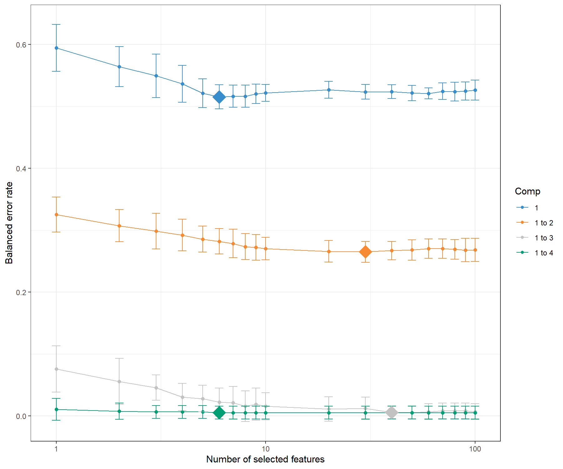
Figure 5.5: Tuning keepX for the sPLS-DA performed on the SRBCT gene expression data. Each coloured line represents the balanced error rate (y-axis) per component across all tested keepX values (x-axis) with the standard deviation based on the repeated cross-validation folds. The diamond indicates the optimal keepX value on a particular component which achieves the lowest classification error rate as determined with a one-sided \(t-\)test. As sPLS-DA is an iterative algorithm, values represented for a given component (e.g. comp 1 to 2) include the optimal keepX value chosen for the previous component (comp 1).
The tuning results depend on the tuning grid list.keepX, as well as the values chosen for folds and nrepeat. Therefore, we recommend assessing the performance of the final model, as well as examining the stability of the selected variables across the different folds, as detailed in the next section.
Figure 5.5 shows that the error rate decreases when more components are included in sPLS-DA. To obtain a more reliable estimation of the error rate, the number of repeats should be increased (between 50 to 100). This type of graph helps not only to choose the ‘optimal’ number of variables to select, but also to confirm the number of components ncomp. From the code below, we can assess that in fact, the addition of a fourth component does not improve the classification (no statistically significant improvement according to a one-sided \(t-\)test), hence we can choose ncomp = 3.
# The optimal number of components according to our one-sided t-tests
tune.splsda.srbct$choice.ncomp$ncomp
## [1] 3## comp1 comp2 comp3 comp4
## 40 9 40 35.3.2 Final model and performance
Here is our final sPLS-DA model with three components and the optimal keepX obtained from our tuning step.
You can choose to skip the tuning step, and input your arbitrarily chosen parameters in the following code (simply specify your own ncomp and keepX values):
# Optimal number of components based on t-tests on the error rate
ncomp <- tune.splsda.srbct$choice.ncomp$ncomp
ncomp
## [1] 3# Optimal number of variables to select
select.keepX <- tune.splsda.srbct$choice.keepX[1:ncomp]
select.keepX## comp1 comp2 comp3
## 40 9 40The performance of the model with the ncomp and keepX parameters is assessed with the perf() function. We use 5-fold validation (folds = 5), repeated 10 times (nrepeat = 10) for illustrative purposes, but we recommend increasing to nrepeat = 50. Here we choose the max.dist prediction distance, based on our results obtained with PLS-DA.
The classification error rates that are output include both the overall error rate, as well as the balanced error rate (BER) when the number of samples per group is not balanced - as is the case in this study.
set.seed(34)  # For reproducibility with this handbook, remove otherwise

perf.splsda.srbct <- perf(splsda.srbct, folds = 5, validation = "Mfold",
                  dist = "max.dist", progressBar = FALSE, nrepeat = 10)

# perf.splsda.srbct  # Lists the different outputs
perf.splsda.srbct$error.rate
## $overall
## max.dist
## comp1 0.434920635
## comp2 0.217460317
## comp3 0.006349206
##
## $BER
## max.dist
## comp1 0.521340580
## comp2 0.276340580
## comp3 0.004673913We can also examine the error rate per class:
## $max.dist
##           comp1       comp2       comp3
## EWS 0.008695652 0.008695652 0.008695652
## BL  0.550000000 0.325000000 0.000000000
## NB  0.966666667 0.566666667 0.000000000
## RMS 0.560000000 0.205000000 0.010000000
These results can be compared with the performance of PLS-DA and show the benefits of variable selection to not only obtain a parsimonious model, but also to improve the classification error rate (overall and per class).
5.3.3 Variable selection and stability
During the repeated cross-validation process in perf() we can record how often the same variables are selected across the folds. This information is important to answer the question: How reproducible is my gene signature when the training set is perturbed via cross-validation?.
par(mfrow=c(1,2))
# For component 1
stable.comp1 <- perf.splsda.srbct$features$stable$comp1
barplot(stable.comp1, xlab = 'variables selected across CV folds',
        ylab = 'Stability frequency',
        main = 'Feature stability for comp = 1')

# For component 2
stable.comp2 <- perf.splsda.srbct$features$stable$comp2
barplot(stable.comp2, xlab = 'variables selected across CV folds',
        ylab = 'Stability frequency',
        main = 'Feature stability for comp = 2')
par(mfrow=c(1,1))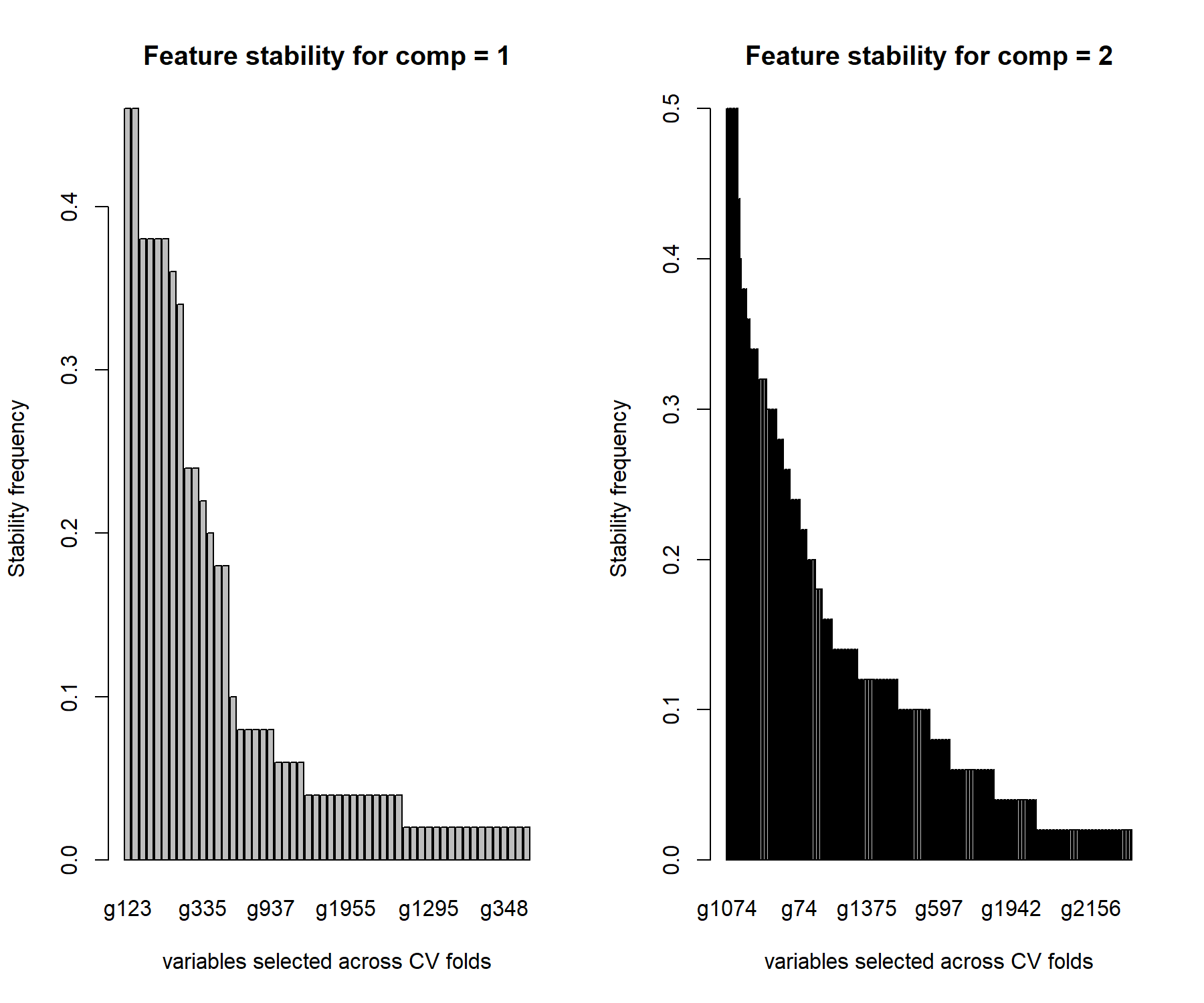
Figure 5.6: Stability of variable selection from the sPLS-DA on the SRBCT gene expression data. We use a by-product from perf() to assess how often the same variables are selected for a given keepX value in the final sPLS-DA model. The barplot represents the frequency of selection across repeated CV folds for each selected gene for component 1 and 2. The genes are ranked according to decreasing frequency.
Figure 5.6 shows that the genes selected on component 1 are moderately stable (frequency < 0.5) whereas those selected on component 2 are more stable (frequency < 0.7). This can be explained as there are various combinations of genes that are discriminative on component 1, whereas the number of combinations decreases as we move to component 2 which attempts to refine the classification.
The function selectVar() outputs the variables selected for a given component and their loading values (ranked in decreasing absolute value). We concatenate those results with the feature stability, as shown here for variables selected on component 1:
# First extract the name of selected var:
select.name <- selectVar(splsda.srbct, comp = 1)$name

# Then extract the stability values from perf:
stability <- perf.splsda.srbct$features$stable$comp1[select.name]

# Just the head of the stability of the selected var:
head(cbind(selectVar(splsda.srbct, comp = 1)$value, stability))
## value.var Var1 Freq
## g123 0.3440470 g123 0.52
## g846 0.2970665 g846 0.52
## g836 0.2543717 g836 0.52
## g1606 0.2520425 g1606 0.52
## g758 0.2517354 g758 0.52
## g335 0.2510154 g335 0.52As we hinted previously, the genes selected on the first component are not necessarily the most stable, suggesting that different combinations can lead to the same discriminative ability of the model. The stability increases in the following components, as the classification task becomes more refined.
Note:
- You can also apply the
vip()function onsplsda.srbct.
5.3.4 Sample visualisation
Previously, we showed the ellipse plots displayed for each class. Here we also use the star argument (star = TRUE), which displays arrows starting from each group centroid towards each individual sample (Figure 5.7).
plotIndiv(splsda.srbct, comp = c(1,2),
          ind.names = FALSE,
          ellipse = TRUE, legend = TRUE,
          star = TRUE,
title = 'SRBCT, sPLS-DA comp 1 - 2')plotIndiv(splsda.srbct, comp = c(2,3),
ind.names = FALSE,
ellipse = TRUE, legend = TRUE,
star = TRUE,
title = 'SRBCT, sPLS-DA comp 2 - 3')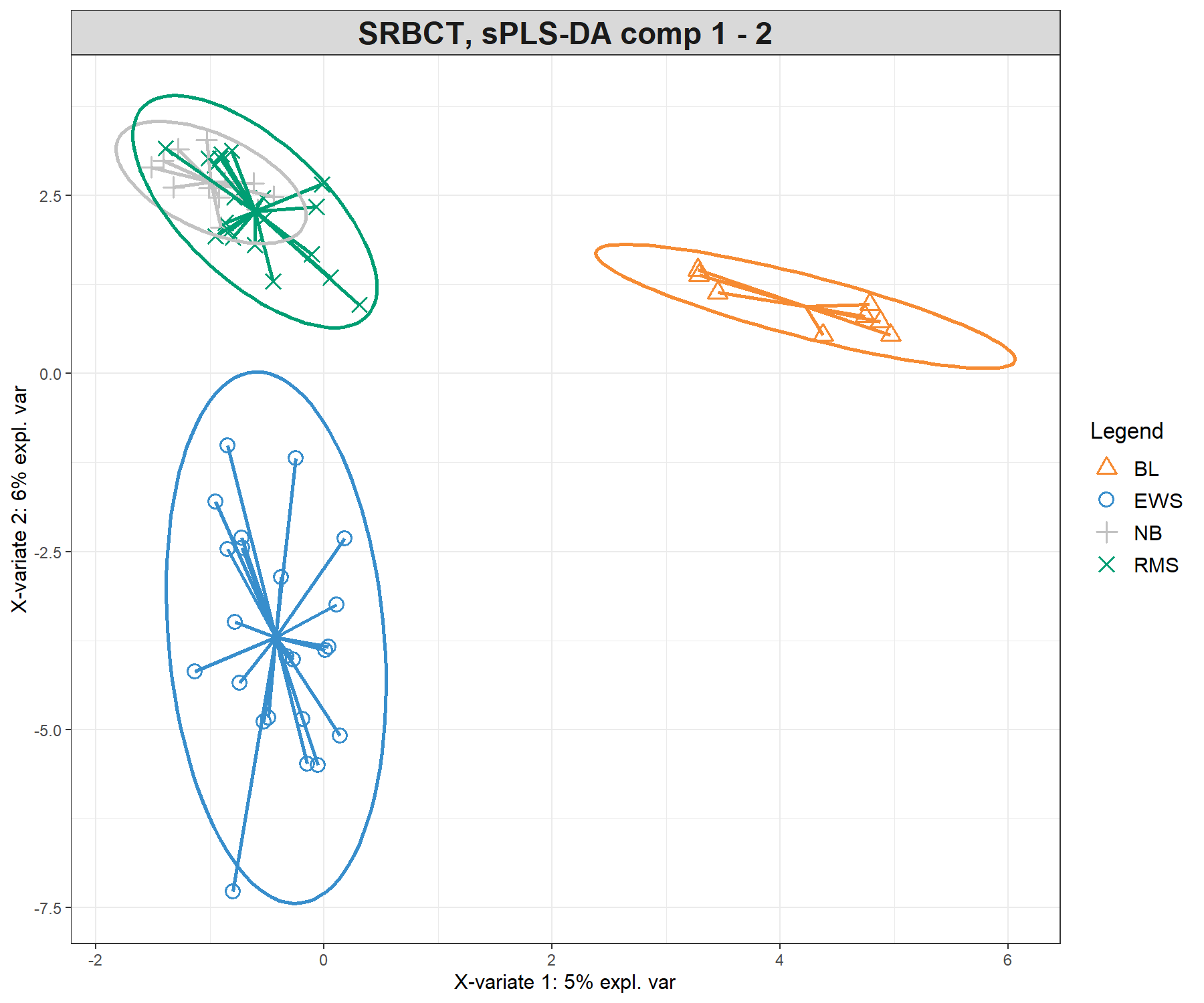
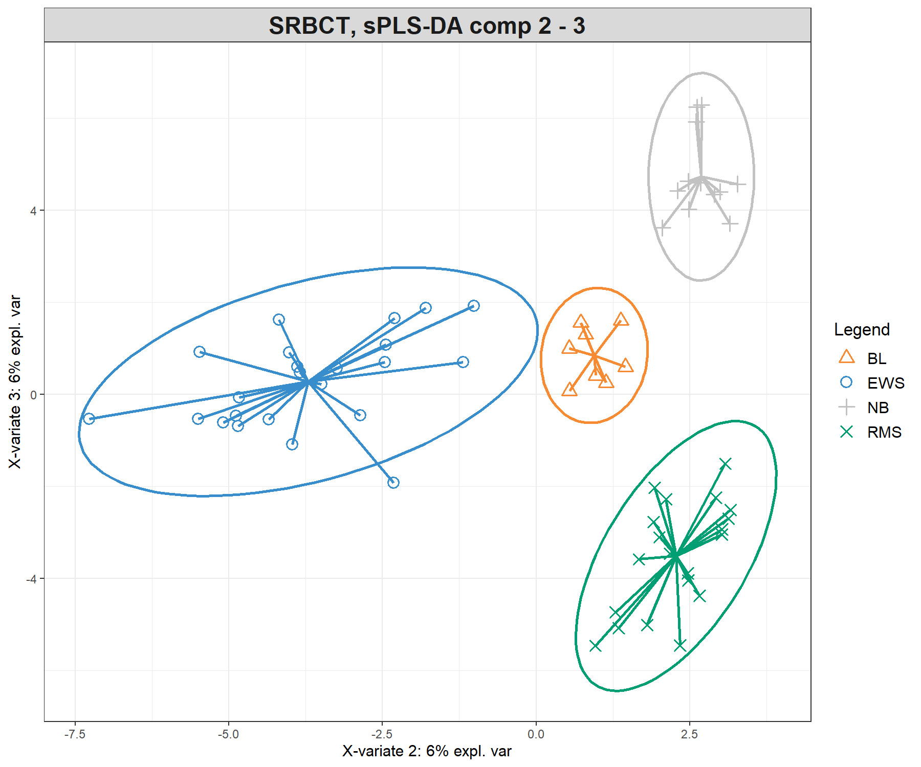
Figure 5.7: Sample plots from the sPLS-DA performed on the SRBCT gene expression data. Samples are projected into the space spanned by the first three components. The plots represent 95% ellipse confidence intervals around each sample class. The start of each arrow represents the centroid of each class in the space spanned by the components. (a) Components 1 and 2 and (b) Components 2 and 3. Samples are coloured by their tumour subtype. Component 1 discriminates BL vs. the rest, component 2 discriminates EWS vs. the rest, while component 3 further discriminates NB vs. RMS vs. the rest. The combination of all three components enables us to discriminate all classes.
The sample plots are different from PLS-DA (Figure 5.3) with an overlap of specific classes (i.e. NB + RMS on component 1 and 2), that are then further separated on component 3, thus showing how the genes selected on each component discriminate particular sets of sample groups.
5.3.5 Variable visualisation
We represent the genes selected with sPLS-DA on the correlation circle plot. Here to increase interpretation, we specify the argument var.names as the first 10 characters of the gene names (Figure 5.8). We also reduce the size of the font with the argument cex.
Note:
- We can store the
plotvar()as an object to output the coordinates and variable names if the plot is too cluttered.
var.name.short <- substr(srbct$gene.name[, 2], 1, 10)
plotVar(splsda.srbct, comp = c(1,2),
        var.names = list(var.name.short), cex = 3)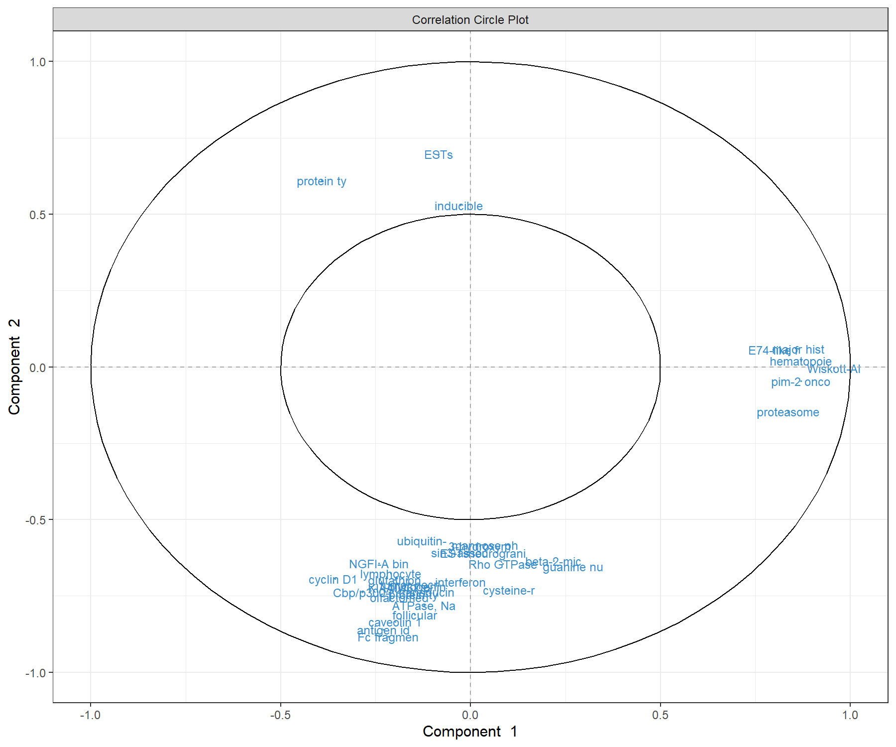
Figure 5.8: Correlation circle plot representing the genes selected by sPLS-DA performed on the SRBCT gene expression data. Gene names are truncated to the first 10 characters. Only the genes selected by sPLS-DA are shown in components 1 and 2. We observe three groups of genes (positively associated with component 1, and positively or negatively associated with component 2). This graphic should be interpreted in conjunction with the sample plot.
By considering both the correlation circle plot (Figure 5.8) and the sample plot in Figure 5.7, we observe that a group of genes with a positive correlation with component 1 (‘EH domain’, ‘proteasome’ etc.) are associated with the BL samples. We also observe two groups of genes either positively or negatively correlated with component 2. These genes are likely to characterise either the NB + RMS classes, or the EWS class. This interpretation can be further examined with the plotLoadings() function.
In this plot, the loading weights of each selected variable on each component are represented (see Module 2). The colours indicate the group in which the expression of the selected gene is maximal based on the mean (method = 'median' is also available for skewed data). For example on component 1:
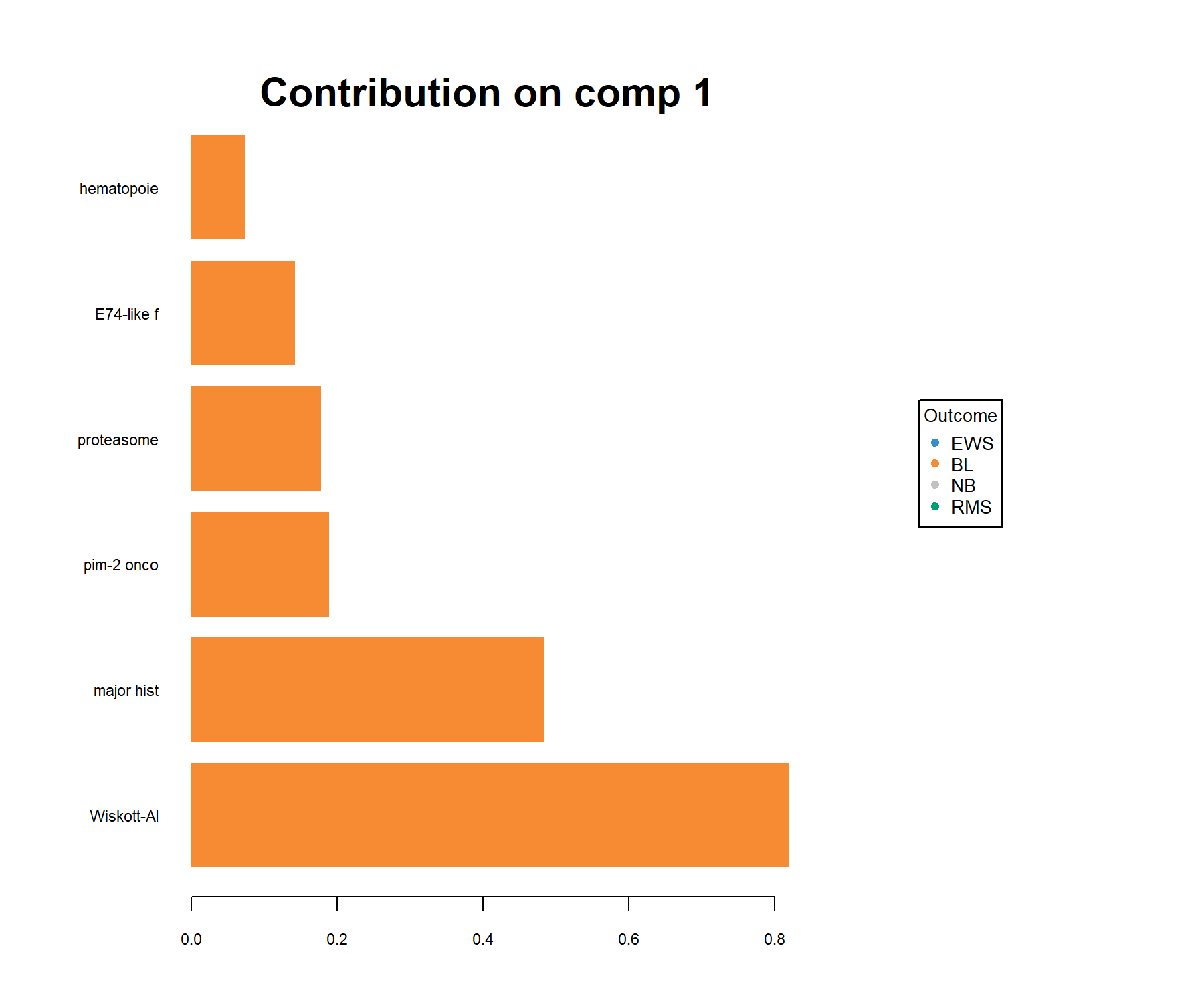
Figure 5.9: Loading plot of the genes selected by sPLS-DA on component 1 on the SRBCT gene expression data. Genes are ranked according to their loading weight (most important at the bottom to least important at the top), represented as a barplot. Colours indicate the class for which a particular gene is maximally expressed, on average, in this particular class. The plot helps to further characterise the gene signature and should be interpreted jointly with the sample plot (Figure 5.7).
Here all genes are associated with BL (on average, their expression levels are higher in this class than in the other classes).
Notes:
- Consider using the argument
ndisplayto only display the top selected genes if the signature is too large. - Consider using the argument
contrib = 'min'to interpret the inverse trend of the signature (i.e. which genes have the smallest expression in which class, here a mix of NB and RMS samples).
To complete the visualisation, the CIM in this special case is a simple hierarchical heatmap (see ?cim) representing the expression levels of the genes selected across all three components with respect to each sample. Here we use an Euclidean distance with Complete agglomeration method, and we specify the argument row.sideColors to colour the samples according to their tumour type (Figure 5.10).
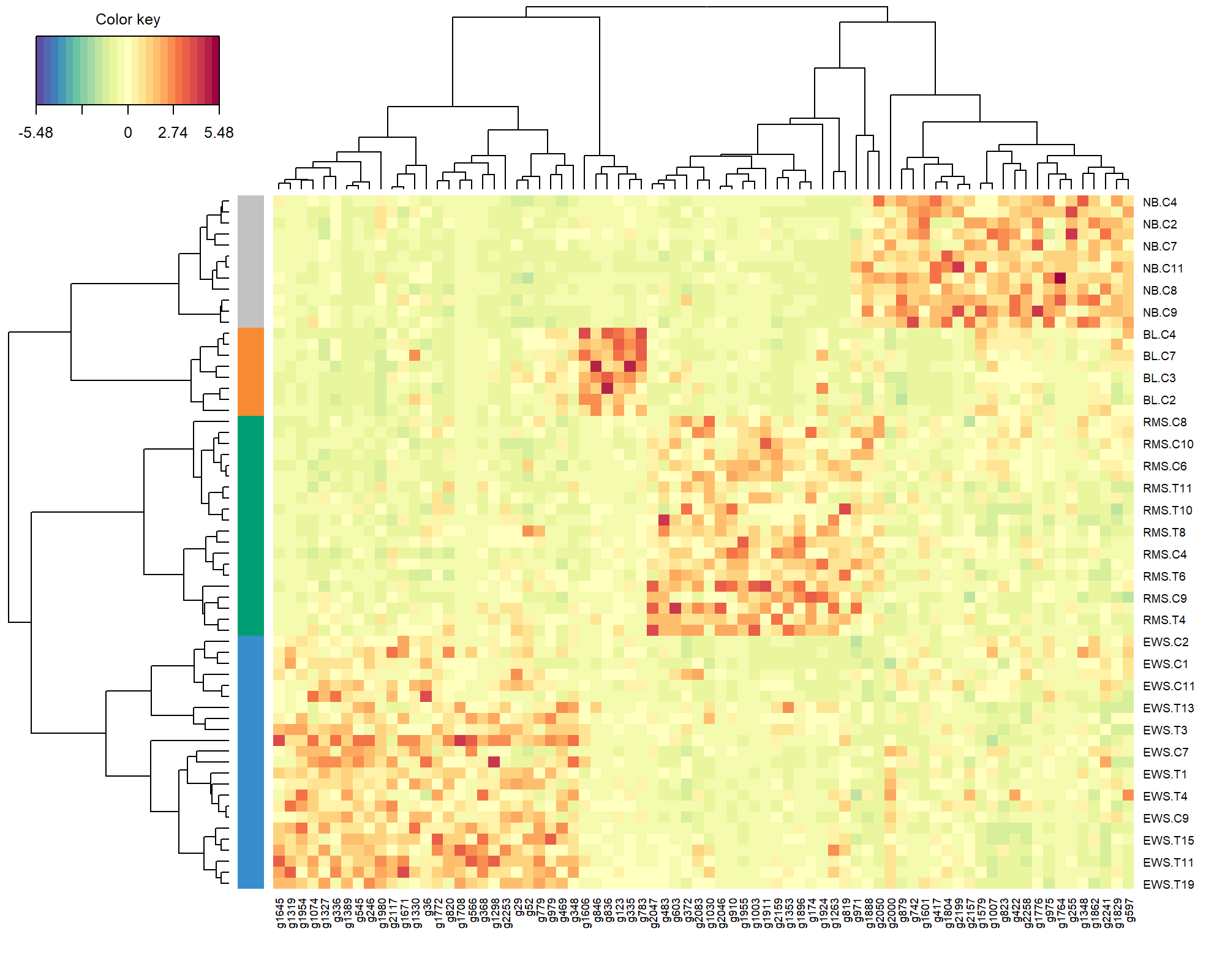
Figure 5.10: Clustered Image Map of the genes selected by sPLS-DA on the SRBCT gene expression data across all 3 components. A hierarchical clustering based on the gene expression levels of the selected genes, with samples in rows coloured according to their tumour subtype (using Euclidean distance with Complete agglomeration method). As expected, we observe a separation of all different tumour types, which are characterised by different levels of expression.
The heatmap shows the level of expression of the genes selected by sPLS-DA across all three components, and the overall ability of the gene signature to discriminate the tumour subtypes.
Note:
- You can change the argument
compif you wish to visualise a specific set of components incim().
5.4 Take a detour: prediction
In this section, we artificially create an ‘external’ test set on which we want to predict the class membership to illustrate the prediction process in sPLS-DA (see Extra Reading material). We randomly select 50 samples from the srbct study as part of the training set, and the remainder as part of the test set:
set.seed(33) # For reproducibility with this handbook, remove otherwise
train <- sample(1:nrow(X), 50)    # Randomly select 50 samples in training
test <- setdiff(1:nrow(X), train) # Rest is part of the test set

# Store matrices into training and test set:
X.train <- X[train, ]
X.test <- X[test,]
Y.train <- Y[train]
Y.test <- Y[test]

# Check dimensions are OK:
dim(X.train); dim(X.test)
## [1] 50 2308
## [1] 13 2308Here we assume that the tuning step was performed on the training set only (it is really important to tune only on the training step to avoid overfitting), and that the optimal keepX values are, for example, keepX = c(20,30,40) on three components. The final model on the training data is:
We now apply the trained model on the test set X.test and we specify the prediction distance, for example mahalanobis.dist (see also ?predict.splsda):
The $class output of our object predict.splsda.srbct gives the predicted classes of the test samples.
First we concatenate the prediction for each of the three components (conditionally on the previous component) and the real class - in a real application case you may not know the true class.
##         mahalanobis.dist.comp1 mahalanobis.dist.comp2 mahalanobis.dist.comp3 Truth
## EWS.T7                     EWS                    EWS                    EWS   EWS
## EWS.T15                    EWS                    EWS                    EWS   EWS
## EWS.C8                     EWS                    EWS                    EWS   EWS
## EWS.C10                    EWS                    EWS                    EWS   EWS
## BL.C8                       BL                     BL                     BL    BL
## NB.C6                       NB                     NB                     NB    NB
If we only look at the final prediction on component 2, compared to the real class:
# Compare prediction on the second component and change as factor
predict.comp2 <- predict.splsda.srbct$class$mahalanobis.dist[,2]
table(factor(predict.comp2, levels = levels(Y)), Y.test)
## Y.test
## EWS BL NB RMS
## EWS 4 0 0 0
## BL 0 1 0 0
## NB 0 0 1 1
## RMS 0 0 0 6And on the third compnent:
# Compare prediction on the third component and change as factor
predict.comp3 <- predict.splsda.srbct$class$mahalanobis.dist[,3]
table(factor(predict.comp3, levels = levels(Y)), Y.test)
## Y.test
## EWS BL NB RMS
## EWS 4 0 0 0
## BL 0 1 0 0
## NB 0 0 1 0
## RMS 0 0 0 7The prediction is better on the third component, compared to a 2-component model.
Next, we look at the output $predict, which gives the predicted dummy scores assigned for each test sample and each class level for a given component (as explained in Extra Reading material). Each column represents a class category:
##                EWS          BL          NB          RMS
## EWS.T7  1.26848551 -0.05273773 -0.24070902  0.024961232
## EWS.T15 1.15058424 -0.02222145 -0.11877994 -0.009582845
## EWS.C8  1.25628411  0.05481026 -0.16500118 -0.146093198
## EWS.C10 0.83995956  0.10871106  0.16452934 -0.113199949
## BL.C8   0.02431262  0.90877176  0.01775304  0.049162580
## NB.C6   0.06738230  0.05086884  0.86247360  0.019275265
In PLS-DA and sPLS-DA, the final prediction call is given based on this matrix on which a pre-specified distance (such as mahalanobis.dist here) is applied. From this output, we can understand the link between the dummy matrix \(\boldsymbol Y\), the prediction, and the importance of choosing the prediction distance. More details are provided in Extra Reading material.
5.5 AUROC outputs complement performance evaluation
As PLS-DA acts as a classifier, we can plot the AUC (Area Under The Curve) ROC (Receiver Operating Characteristics) to complement the sPLS-DA classification performance results. The AUC is calculated from training cross-validation sets and averaged. The ROC curve is displayed in Figure 5.11. In a multiclass setting, each curve represents one class vs. the others and the AUC is indicated in the legend, and also in the numerical output:
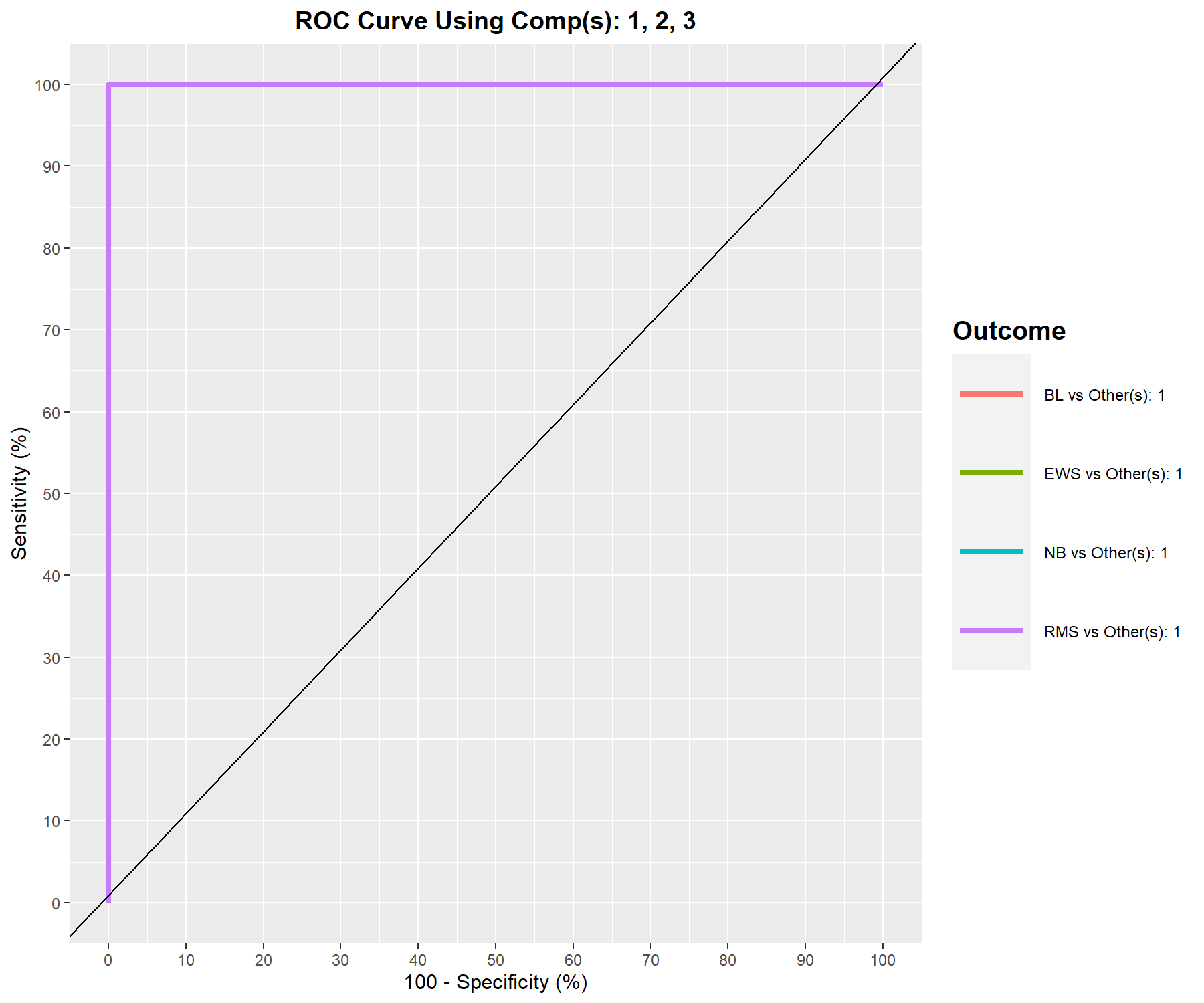
Figure 5.11: ROC curve and AUC from sPLS-DA on the SRBCT gene expression data on component 1 averaged across one-vs.-all comparisons. Numerical outputs include the AUC and a Wilcoxon test p-value for each ‘one vs. other’ class comparisons that are performed per component. This output complements the sPLS-DA performance evaluation but should not be used for tuning (as the prediction process in sPLS-DA is based on prediction distances, not a cutoff that maximises specificity and sensitivity as in ROC). The plot suggests that the sPLS-DA model can distinguish BL subjects from the other groups with a high true positive and low false positive rate, while the model is less well able to distinguish samples from other classes on component 1.
## $Comp1
##                    AUC   p-value
## EWS vs Other(s) 0.5304 6.894e-01
## BL vs Other(s)  1.0000 5.586e-06
## NB vs Other(s)  0.6013 2.778e-01
## RMS vs Other(s) 0.6512 5.492e-02
##
## $Comp2
##                    AUC   p-value
## EWS vs Other(s) 1.0000 5.135e-11
## BL vs Other(s)  1.0000 5.586e-06
## NB vs Other(s)  0.8497 1.799e-04
## RMS vs Other(s) 0.8291 2.932e-05
##
## $Comp3
##                 AUC   p-value
## EWS vs Other(s)   1 5.135e-11
## BL vs Other(s)    1 5.586e-06
## NB vs Other(s)    1 8.505e-08
## RMS vs Other(s)   1 2.164e-10
The ideal ROC curve should be along the top left corner, indicating a high true positive rate (sensitivity on the y-axis) and a high true negative rate (or low 100 - specificity on the x-axis), with an AUC close to 1. This is the case for BL vs. the others on component 1. The numerical output shows a perfect classification on component 3.
Note:
- A word of caution when using the ROC and AUC in s/PLS-DA: these criteria may not be particularly insightful, or may not be in full agreement with the s/PLS-DA performance, as the prediction threshold in PLS-DA is based on a specified distance as we described earlier in this section and in Extra Reading material related to PLS-DA. Thus, such a result complements the sPLS-DA performance we have calculated earlier.